Keep it simple, Stupid

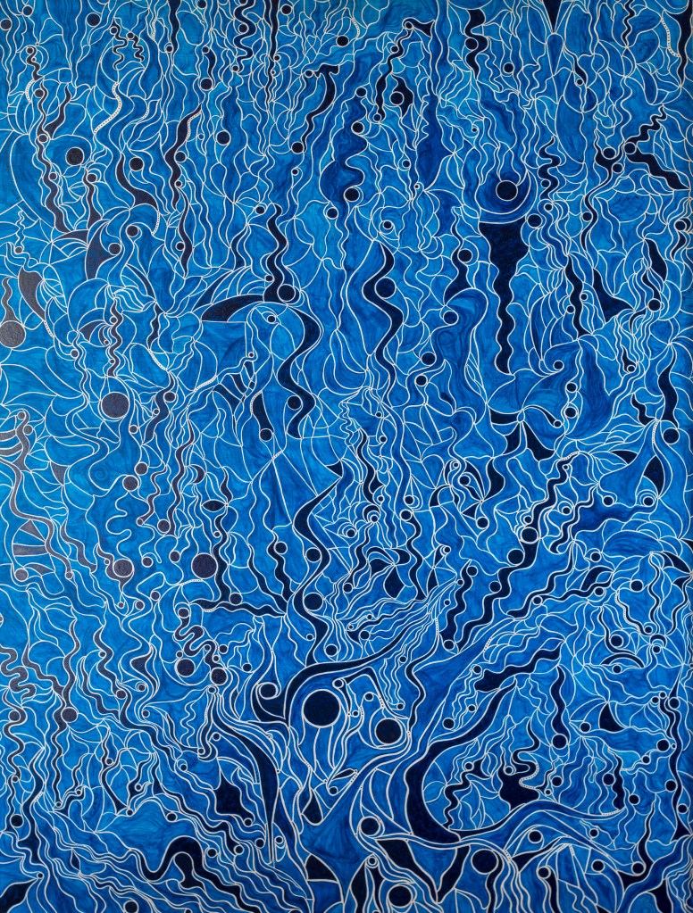
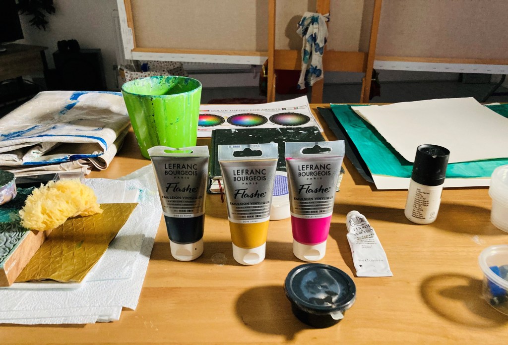
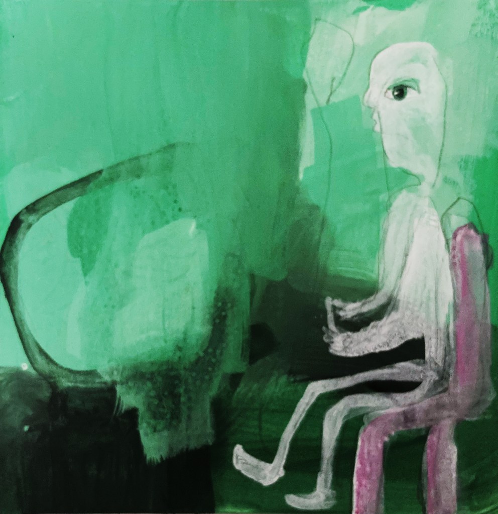
After getting myself in a right pickle with my interim show painting, and almost flogging it into oblivion, I decided to take a more simple approach to the green paintings. My main focus at the moment is colour. Using the colour wheel I mentioned in my last post, I set myself the task of mixing my own greens using two colours, and then adding black and white to create different tones. I then added a colour on the opposite side of the wheel, known as a complimentary colour, and painted some little paintings to explore the colours and tones I created.

For my first experiments, I used phthalo green (blue shade) and yellow light, with red violet as the complimentary. It was nice not to have the pressure of creating an actual painting, and because I wasn’t trying so hard, some little paintings did pop out. The lighter tones are too bright and minty for the underwater paintings I have in mind, although they might be good for the odd highlight here and there. I really like the darker tones, and will definitely keep them in my bag of tricks. I also think it works better when the complimentary colour is quite strong, as in the painting below (which is of my fella playing Destiny and losing his hair from the stress of it).

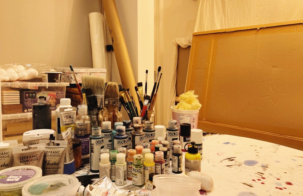
Last week I decided to declutter the studio. Wow, what a difference it makes. I love being in here even more now, and find it much more conducive to arting. Of course, unless you’re a de-clutterer of the ruthless variety, the clutter has to go somewhere. Mine has gone into the room that my fella was going to use as an office. However, the non-fibre broadband we have out here in the woop woops isn’t good enough for his job, so he still works in his flat in Ramsey. With the empty space too tempting not to fill, it is now home to canvases and paints and things. According to my fella, I have now peed in every corner of the house, and if we ever do get fibre out here, he’ll need to water-proof the shed.

Flogging a dead horse-hat

The other day I was lamenting to my fella about the agony I was going through trying to paint my green paintings, one of which I was hoping to get finished for the Interim Show. To clarify, he asked if I meant the paintings that if I didn’t do them there would be absolutely no consequences. That made me laugh so much. Because he was right, not just about the green paintings, but about painting in general. Absolutely nothing of consequence would happen if I never painted another thing. Sure, I’d fail my MA, and have a lot of time on hands, but no one would die, and except for a handful of people, no one in the world would even notice. And yet, I put myself under an inordinate amount of pressure, and approach my painting practice like my life, if not the world, depends on it. This has been true of the green paintings, particularly the one I had in mind for the interim show.

I absolutely love the painting I had in mind for the show, but I have come to the painful conclusion that it simply won’t be finished in time. Because it is a new type of painting for me, there is a certain developmental process that it has to go through, and rushing or missing out aspects of that process has so far resulted in a frustrating, dead-horse-flogging mess. So, before I flog the idea into oblivion, I’m going to return to the beginning of the development process, so I can build a firm foundation for the type of paintings I want to do. In which case, for the next couple of months, I will focus on colour and drawing figures.

During my last one to one tutorial, Jonathan put me onto a brilliant colour theorist, Florent Farges. I’ve already watched one of his videos, and it was extremely helpful, as is his self-designed colour-wheel system, that takes into account hue, chroma, and value. It’s all pretty technical, but I think it will be well worth the time and effort it will take to get to grips with it. So, watching his other videos, studying his wheel/s, and experimenting with colour is high on my list of priorities.

I have also signed-up for a couple of online illustration courses. So far, they have been enjoyable and easy to follow. I don’t want to do realistic drawings, and am not interested in portraiture, but I do want to develop my ability to draw expressive characters which convey emotion.

Instead of showing one of the green paintings at the Interim Show, I am going to show a painting I did when I lived in Australia. I have never shown it before, and very few people have ever seen it. That’s because I hid it in my studio due to what I perceived as a mistake in it. I always thought it was a shame, because apart from that, I thought it was a beautiful painting. Then COVID came along, the world went crazy, and I finally plucked up the courage to paint-out the mistake, and I’m pleased to say it worked, and the painting is now fit to be seen.

Acheron 90cm x 120cm acrylic on board

According to Greek mythology, Acheron (lit. river of woe) is the name of one the rivers in the underworld, which, along with the river Styx, Charon ferries the souls of the dead across. It’s an apt title for the painting, as I painted it at a time when I was miserable with unrequited love, an experience that sent my life into a tail-spin of hadesian proportions. Ahh, at least I got this painting out of it. A fair price I think.