All cakes are not created equal!

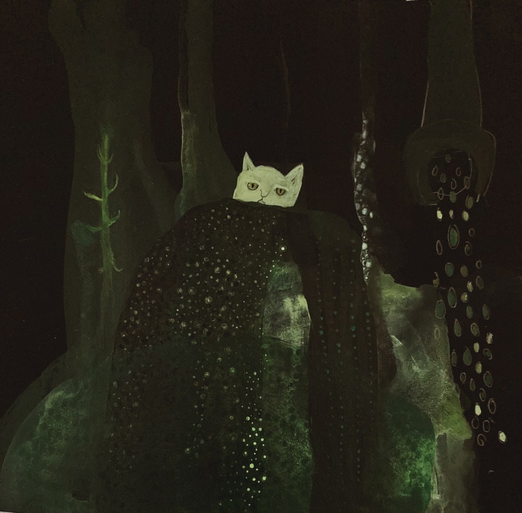
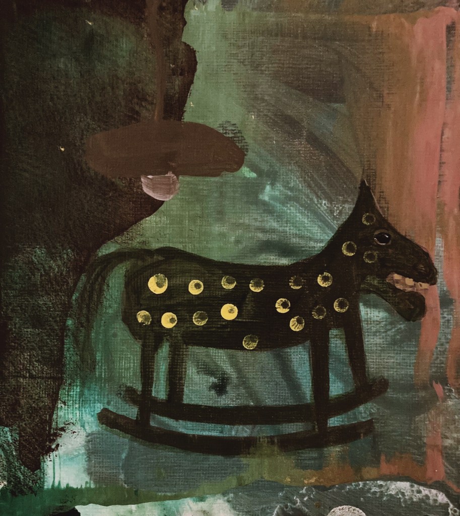
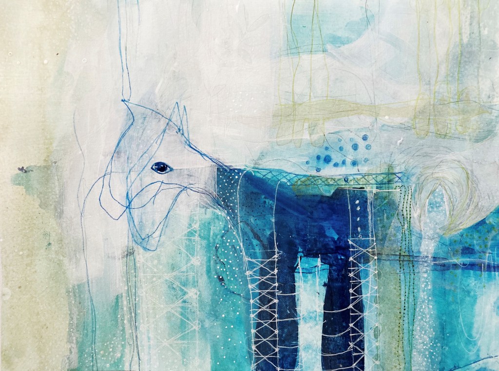
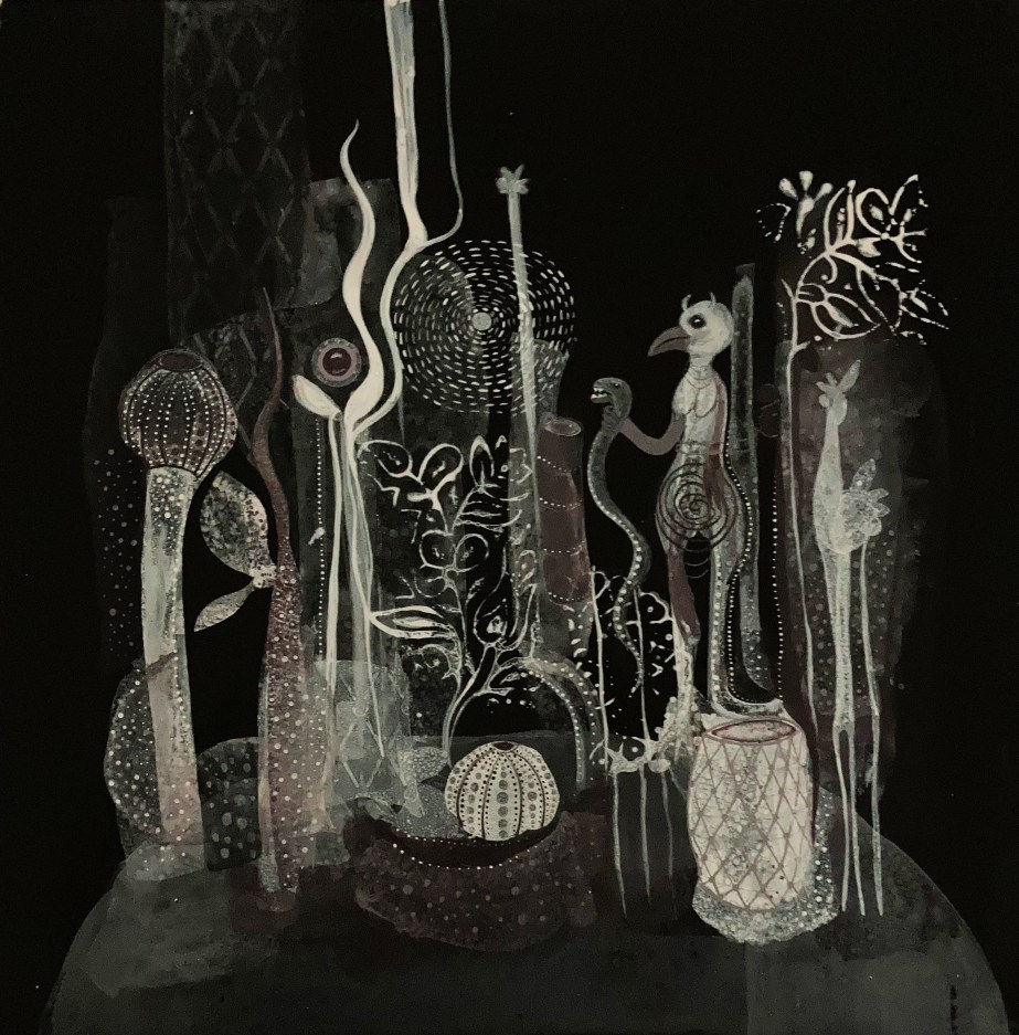
I had a very productive week in the studio, and am finding my feet with the figurative paintings. I am still very much at the experimental phase, but am slowly discovering the kind of paintings I want to make.

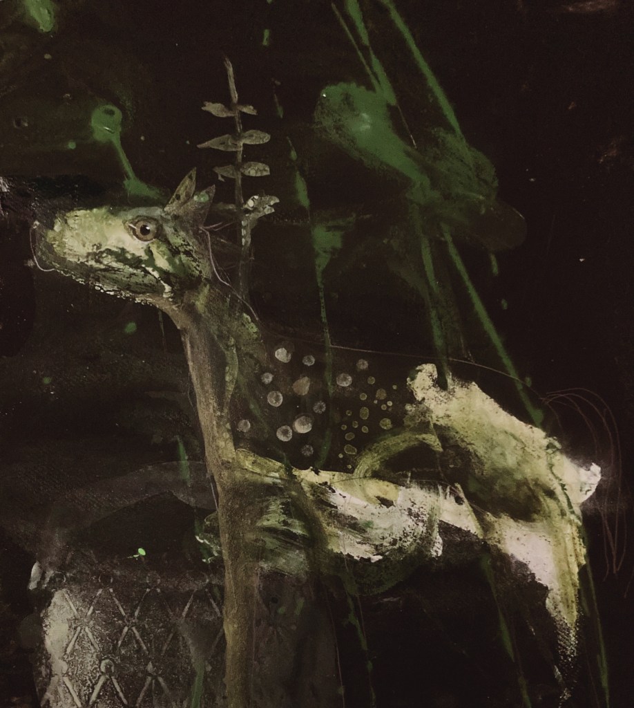
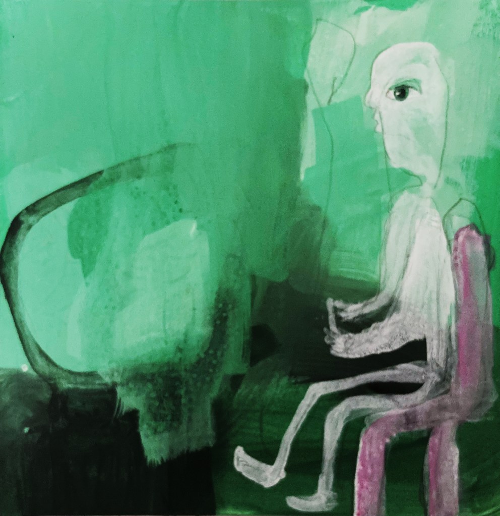
Here are two of the paintings I did this week. I like them both, however, the one on the right has an underpainting that I made with the sea, and I think it adds a greater sense of dynamism. I definitely think a dynamic underpainting is the way forward. I don’t like figurative paintings that look too finished or realistic, except for the eyes.

The main focus of the course at the moment is the research paper we each have to write. I haven’t got much further than a vague notion of a topic, death. So far I have been looking into memento mori (a medieval artistic convention designed to remind people they will die), memorial art (which is right up my alley artistically), or ars moriendi (a medieval instruction book on how to die). Not very cheery, true, but death is a topic I am very interested in, both as a painter and a mortal. I will to have to pick a lane soon, as we have 1,000 word overview due next week.

I actually had a dream last night about doing my research paper on the Ars Moriendi. The book is from the mid-15th century, and instructed a person in how to have a “good death”, which basically consisted of letting a group of angels and demons battle it out for your soul on your deathbed, in the hope that your soul (which was depicted as a mini-you that popped out your mouth when you died) got to go with the good guys. The likelihood of that happening depended on answering a series of questions. Didn’t get the questions answered in time? Sorry, that’s eternal damnation for you! The book was wildly popular throughout Europe, and peasant and king alike were subject to its teaching.

One of the woodcuts from the Ars Moriendi.

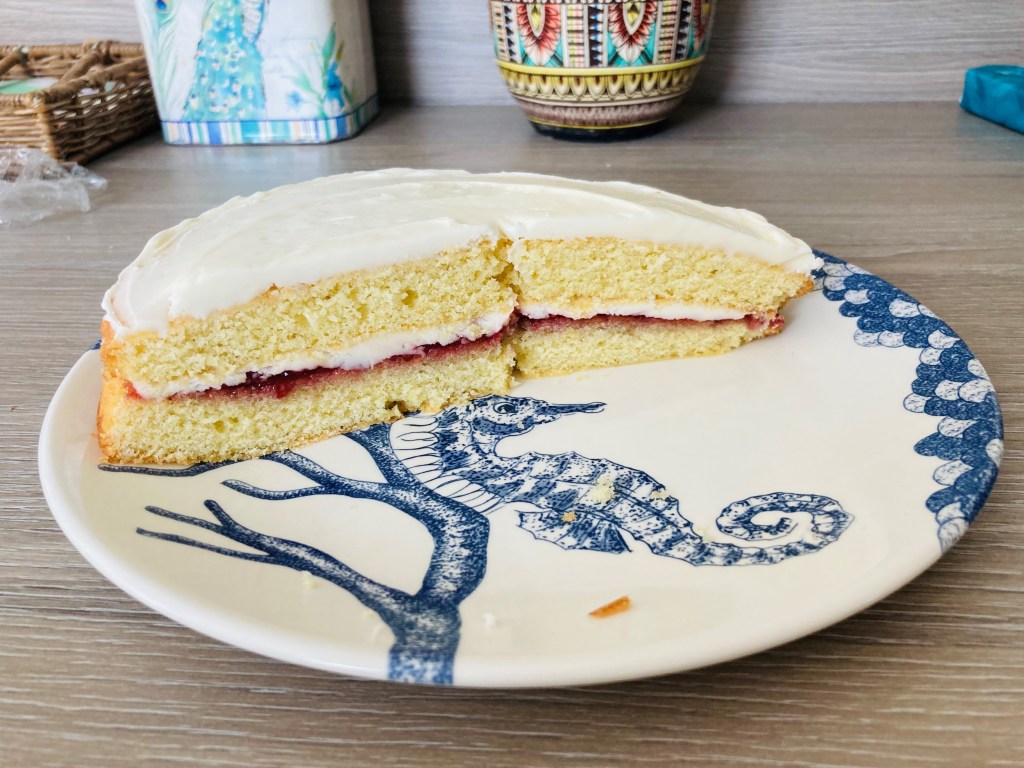
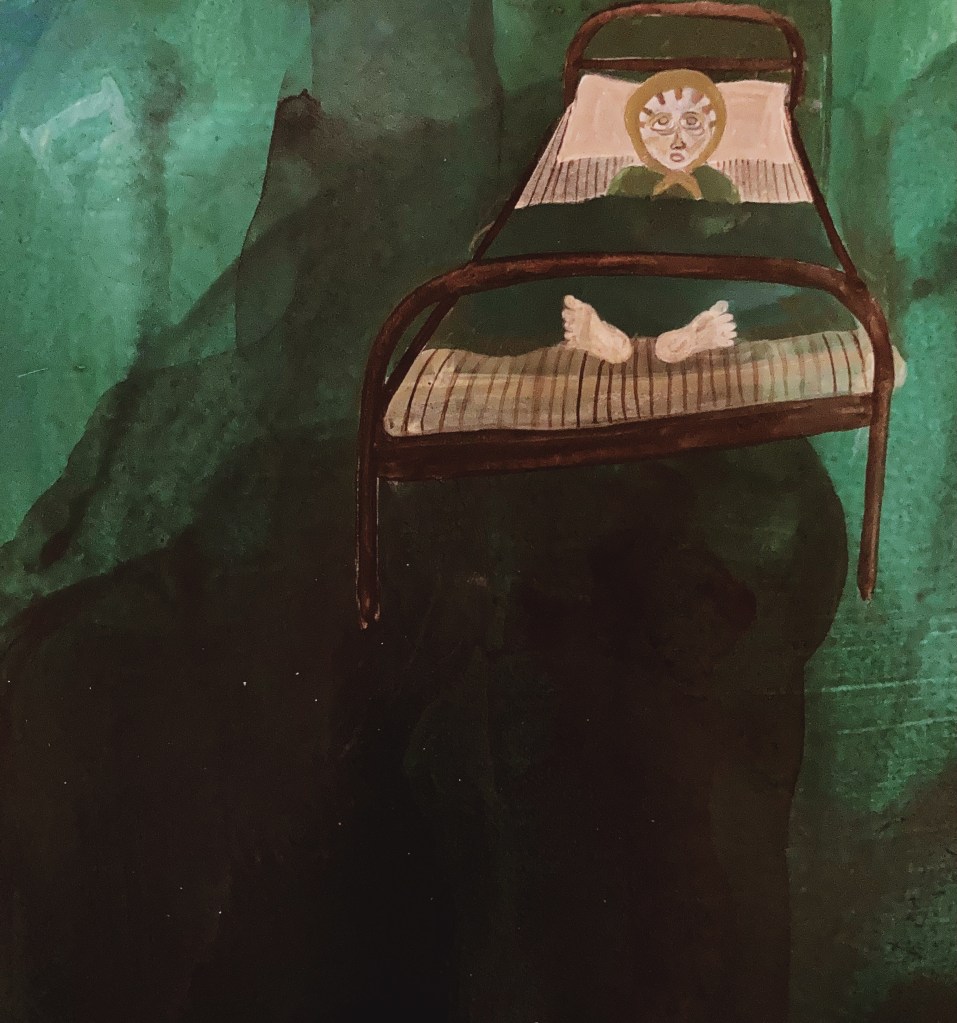
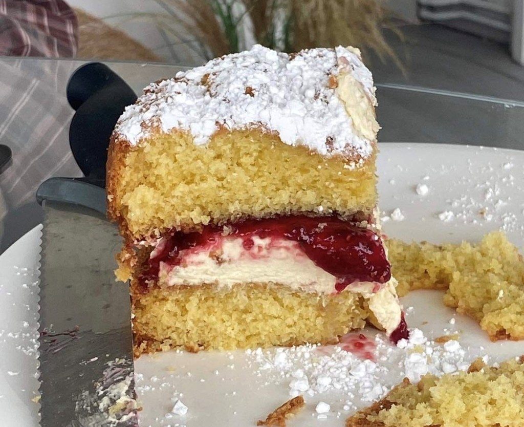
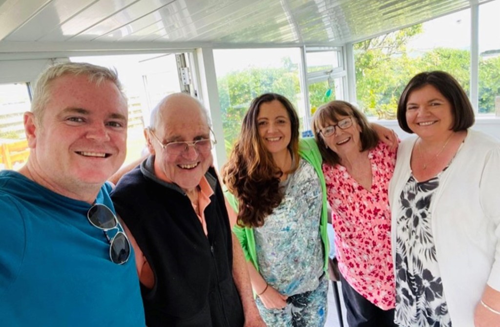
My sister was on the Island for a few days, which was lovely. We had a family bbq at Anam Cara on the Sunday, and I showed them the Ann painting. It made my tender-hearted sister cry, which was either a sign that the painting is beautiful, or the Eurovision hoolie at my brother’s the night before was too much for her. My fella did me proud and didn’t burn the sausages, and made the most glorious Victoria sponge, which almost made me cry. Below is the only photo we have of the whole event, but to be honest, I reckon its the thing we’ll all remember the most. It was a damn good cake!

Thankfully, we did manage to get some photos of us all when the gang popped out later in the week. We had a lovely time just sitting there chatting, and marvelled at the fact that we were still sitting there chatting after all these years.

My fella is in Rotterdam for work this week and I miss him terribly, not just for his cake baking abilities. Though, it would be reason enough, as I had a go at a Victoria sponge and I don’t know what kind of WI witchery he used in his, but mine came out flat as a pancake. Still, the jam and icing has made it edible.

Birds of a feather

It was another good week in the studio. For most of it I carried on with the seawater paintings, which was very enjoyable. However, I took a break from them on the weekend and returned to the figurative paintings.

I still feel like I am a long way from figuring out what kind of paintings I want them to be, so I think the best thing I can do in the meantime is to keep experimenting. It’s like the big little-man said:

Inspiration does exist, but it must find you working.

Pablo Picasso

To that end, I’ve been noodling around with some small paintings to see what might pop out. It turns out, an owl and a pussy cat!

The most important thing I can do to achieve my goal for these figurative paintings, is draw, which I am still doing every day. This week I drew birds, and I have say, they are my favourite thing to draw so far.

Drawing in general still has the sense of an arduous task about it, but drawing birds brings it close to pure enjoyment. They are such delightful creatures, and have so much character.

By way of demonstration, when I was drawing birds outside on Thursday, one left a little gift on my page, which I took to be a very good sign indeed!

While on the subject of birds, I thought I’d share The Wisdom Daily video I made this week, until I remembered I made it about a fish not a bird. But it’s such an amazing fish, I may as well share it anyway.

Bubble bubble toil and trouble

All and all it has been a good week in the studio. I continued with the sea paintings, and ranged far and wide with my experiments, with various degrees of success. One element that kept cropping up was bubbles. That’s because I have been learning about them and watching them.

Sea foam is made up of bubbles, and they are what helps the sea breathe. The sound a wave makes when it crashes is the sound of the individual bubbles being formed, and the tone of each bubble tells you what size it is. I think this fascinating, mysterious, and beautiful, and I love watching them come in and out of existence.

I have been thinking a lot about the power of the sea, something that is inescapable when you live so close to it. I came across a beautiful photo that demonstrates just how powerful it is. It was taken by renowned Manx photographer, Chris Killip, in the early 1970’s, and shows a house being taken by the sea at Cranstal, Bride (the same stretch of coast I live on). I think it is a sobering and romantic image.

For me, it is a memento mori (Latin: remember you shall die), which was a type of medieval painting that depicted various objects that reminded people they will one day die – such as skulls, hourglasses, rotting fruit, wilting flowers and, of course, bubbles. I think Killip’s photograph is an especially poignant memento mori in this day and age, with global warming and the predicted rise in sea levels etc., making coastal erosion and its attendant destruction a present and coming reality. As with sea related disasters, such as tidal waves, death can come upon a person suddenly with little or no warning, but for most, as with coastal erosion, death creeps upon us slowly, diminishing our life force a little at a time, until there is nothing left. It may not be everyone’s cup of tea, but I think it’s worth bearing that in mind.

In other news, I continued drawing chairs this week. My favourite to draw are white-plastic lawn chairs. They are tricky to get the knack of, but I really love them for some reason. I have certainly sat in my fair share of them.

Week 23 Experiments

I thought it might be a good idea to create a weekly post (that I add to daily) of my painting experiments for the confluence project, a kind of visual-log of my progress.

NB: unless otherwise stated, all paintings are acrylic on paper

Monday, 24 April

No.1 – I like the colours and balance.

No.2 – I like the light, and the highlights on the horses legs.

No.3 – Although flatter than the other 2 paintings, I like the smooth finish on this one. I also like the white line drawings.

Tuesday, 25th April

No.4 – I like the falling water (it has a mystical quality, which is appropriate for water). I also like the bird’s eye. I want the eyes in my paintings to be soulful and convey emotion.

No.5 – I love the grid, especially the white outlines. I also like the chair (for some strange reason I love chairs in paintings…I wonder if it has to do with the fact that a chair is usually the example given when discussing Plato’s world of forms). Although I do like the white line drawing, I think I prefer a more abstract drawing, like no.3.

Wednesday, 26th April

No.6 – This is my favourite so far, everything about it works for me. I think the grid is gorgeous, the inspiration for it was from a photo a friend in NZ posted of Instagram of a building in Wellington. She did her masters thesis on Hecate, the goddess of crossroads. I was just reading about Hecate and crossroads the other day. A river confluence is a type of crossroad, hence why they were seen to be imbued with power. I thought it might be interesting to represent a river confluence in my paintings with this grid, as opposed to an actual depiction of two rivers meeting.

I also like this type of chair, and think it looks good in a painting. Palette good.

No.7 – I love cranes and industrial machinery, especially those involved with water. In general, I find cross-hatching aesthetically pleasing. I think a crane (or in this case an oilrig), will work better as a line-drawing in a painting than flowers (as No.5 above).

Thursday, 27 April

No.8 – I absolutely love this painting. It is about death, as symbolised by the following: the grid – confluence (entrance to the underworld); apples = seeds of new life (the Celts buried people with apples – a tradition that is thought to go much further back); material = (the veil between this world and the next). The palette is great.

No.9 – I really like the white colour, which I made using Titan buff and a touch of orange and magenta. It is the salmon-looking colour I have been using in the grid. It goes really well with green and brown.

Friday, 28th April

No.10 – This is a gear shift from the other paintings this week. It was such a beautiful day, so I decided to take some paper and paint down to the sea. Similar to the rain paintings last term, I then painted into the marks made by the water. There are still elements from the other paintings present, such as the horse, water, and carne motif. I’m not as keen on the palette, although I guess it suits this type of painting. I would be interested to see it with a palette like No.8. It was wonderful to paint with the sea, and I would like to do more of that over the summer.

Sunday, 30th April

No.11 – This is another sea painting from Friday, that I then painted into. I love how the organic shapes made by the sea, leant themselves to the final image. It is also interesting how the sea paintings are akin to the rain paintings from last term. I think I should explore this style further. Ultimately, I’d like to merge the two styles together.

It is finished!

I finished the Ann painting this week. The last section was quite fiddly and intense to paint, and it was a sweet relief when it was over. I didn’t even stand back and look at it afterwards, I just pushed it in the corner of the studio, facing the wall, so it can dry. Once it has, I will look at it with fresh eyes. I will also have an open-studio, so friends and family can come and see it. I especially look forward to showing my mum, as I feel the painting has a special connection to her. As I mentioned before, not only has she been helping me with the research for Ann Thompson’s story, but her middle and maiden name are also Ann Thompson, which I think is very special.

There’s always a bit of an anti-climax when I finish a big, labour intensive painting like that, and I tend to feel a little bit lost, in terms of what to do next. To keep up the momentum of my art practice, I make sure I keep my 3 daily painting sessions. Since finishing the Ann painting, I’ve been playing with old paintings that were never really resolved, working on what might possibly be my next big painting, and painting horses.

It’s enjoyable just playing and experimenting, but very soon I will have to focus on my MA project about water. I will also have to start looking at the other artworks I want to make to go with the Ann painting, particularly the film, as well as consolidate the research into Ann’s story, and see where the holes are, and where further research is required. There’s a lot to do, but for the next few days, I think I’ll just play.

I had a couple of workshops this week. One was about socially engaged art, with David McGovern, which I found really informative and interesting. The other was one our whole class did together, called “Emerging dialogues through textile and visual arrangements” with Sukie Sagoo-Reddy. It was actually a workshop I had done last term, even so, it was enjoyable and inspiring to do again, especially with all my classmates. My favourite task was called “chasing shadows”, where we were asked to create a piece of work that involved shadows. I decided to arrange and photograph the shadows cast by these beautiful glass ornaments made by a lovely friend of mine. I love how glass effectively casts coloured shadows.

Anam Cara (where I live) has been exceptionally beautiful this week, and my new favourite thing is to sit on the front lawn, facing the sea, and do the readings for my research paper. To be honest, I spend most of the time just looking at the sea (keeping an eye out for Fonzi of course), or closing my eyes to heighten the sensation of being in such an exhilarating place.

Dotty is as dotty does

I love dots. I love seeing them and I love putting them in my paintings. Nearly all my paintings have at least a little bunch or line of dots. In fact, most have lots of dots, and there are some that are completely covered in them. Dots are a pleasure to paint and are like sugar for my eyes. Basically, I can’t get enough of them.

Another thing I love are patterns. Whether in nature or by human hand, seeing a pattern makes my heart happy. If coupled with symmetry, as any self-respecting pattern is, then I am compelled to stop and stare, and invariably take a photo. For this reason, I have more photos of the spectacular wrought-iron work I saw on our recent holiday to Tuscany, than of the stunning scenery. Just ask my fella, he had to stop and hold my handbag every time I saw a lattice, and practically every house in the hill-top medieval towns we visited had them.

The beauty of the lattice-work I saw, inspired me to begin including it my paintings, which I did for a series I painted while at the Royal College of Art Summer School. I think it’s probably best not to over do it, but I little here and there looks lovely.

For the green paintings I’m doing for my first research project, I’d like to include more complex pattern work. So this past week, I have been experimenting with patterns from Victorian wallpaper. I like the results so far. When I am in London next week, I will try and visit the Victoria and Albert Museum to find some more inspirational patterns.

I miss my dead-lady-bed

I love a good nap. And by far the best napping I have ever done was in my dead-lady-bed. The bed was a fixture in my last apartment, which I rented for 12 years (the longest I’ve lived anywhere). It got its dead-lady moniker because I am convinced an old lady died in it. It was a single, motorised bed that moved up and down, like you find in an old-folks home, and had a mattress so insanely comfortable, that even though I now sleep in a fancy super-king bed with a memory-foam mattress, I still find myself hankering for the warm embrace of my dead-lady-bed.

Coincidently (or perhaps not), the painting I had in mind for the Interim Show featured a dead lady in a bed. Although I wasn’t able bring the whole concept of the painting to fruition in time (of which the dead-lady-in-a-bed was just one element), it certainly wasn’t for want of trying.

Even though the painting doesn’t yet exist in its final form, I love it with a passion, and will do everything within my artistic powers to make it exist. Seeing the little experiments above gives me heart that it will!

Keep it simple, Stupid

After getting myself in a right pickle with my interim show painting, and almost flogging it into oblivion, I decided to take a more simple approach to the green paintings. My main focus at the moment is colour. Using the colour wheel I mentioned in my last post, I set myself the task of mixing my own greens using two colours, and then adding black and white to create different tones. I then added a colour on the opposite side of the wheel, known as a complimentary colour, and painted some little paintings to explore the colours and tones I created.

For my first experiments, I used phthalo green (blue shade) and yellow light, with red violet as the complimentary. It was nice not to have the pressure of creating an actual painting, and because I wasn’t trying so hard, some little paintings did pop out. The lighter tones are too bright and minty for the underwater paintings I have in mind, although they might be good for the odd highlight here and there. I really like the darker tones, and will definitely keep them in my bag of tricks. I also think it works better when the complimentary colour is quite strong, as in the painting below (which is of my fella playing Destiny and losing his hair from the stress of it).

Last week I decided to declutter the studio. Wow, what a difference it makes. I love being in here even more now, and find it much more conducive to arting. Of course, unless you’re a de-clutterer of the ruthless variety, the clutter has to go somewhere. Mine has gone into the room that my fella was going to use as an office. However, the non-fibre broadband we have out here in the woop woops isn’t good enough for his job, so he still works in his flat in Ramsey. With the empty space too tempting not to fill, it is now home to canvases and paints and things. According to my fella, I have now peed in every corner of the house, and if we ever do get fibre out here, he’ll need to water-proof the shed.