Flogging a dead horse-hat

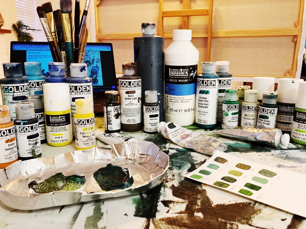
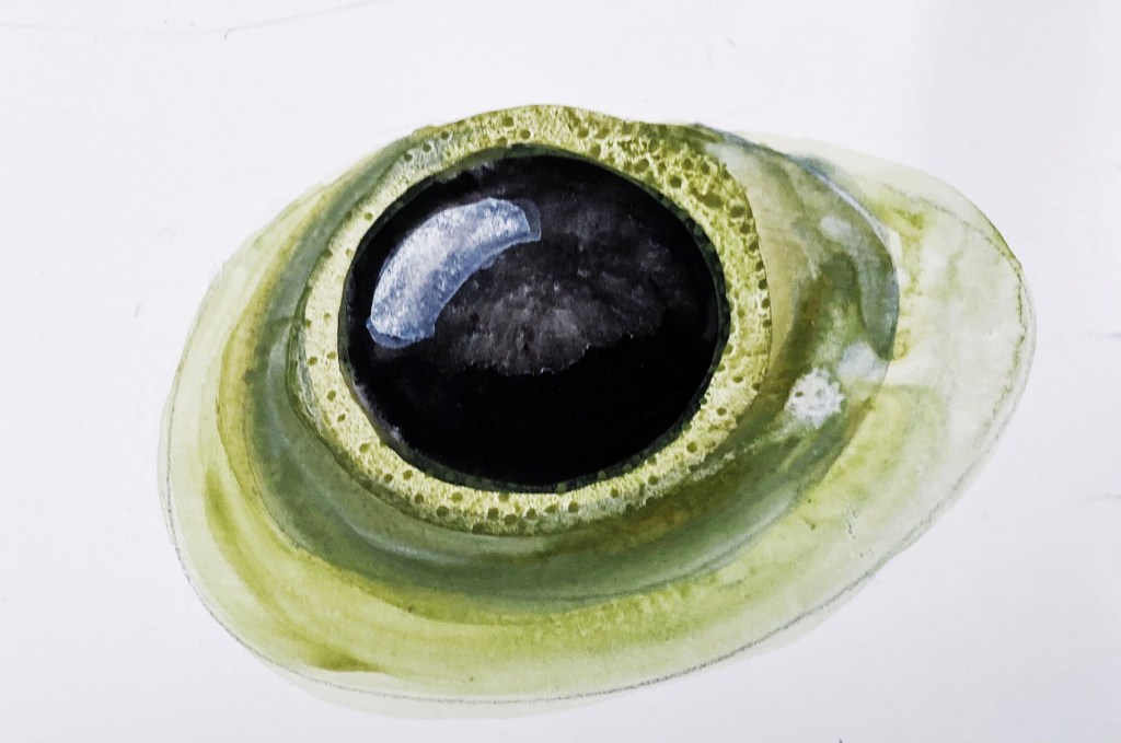
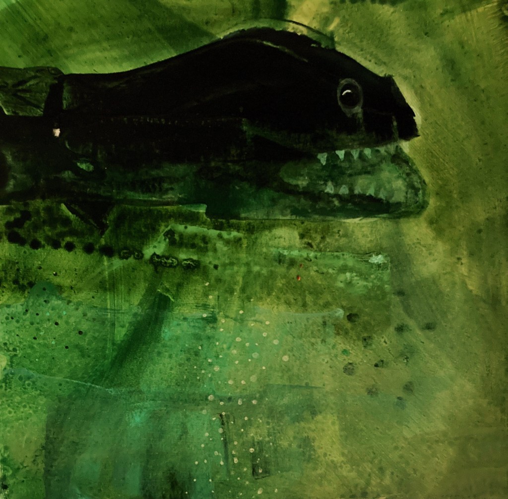
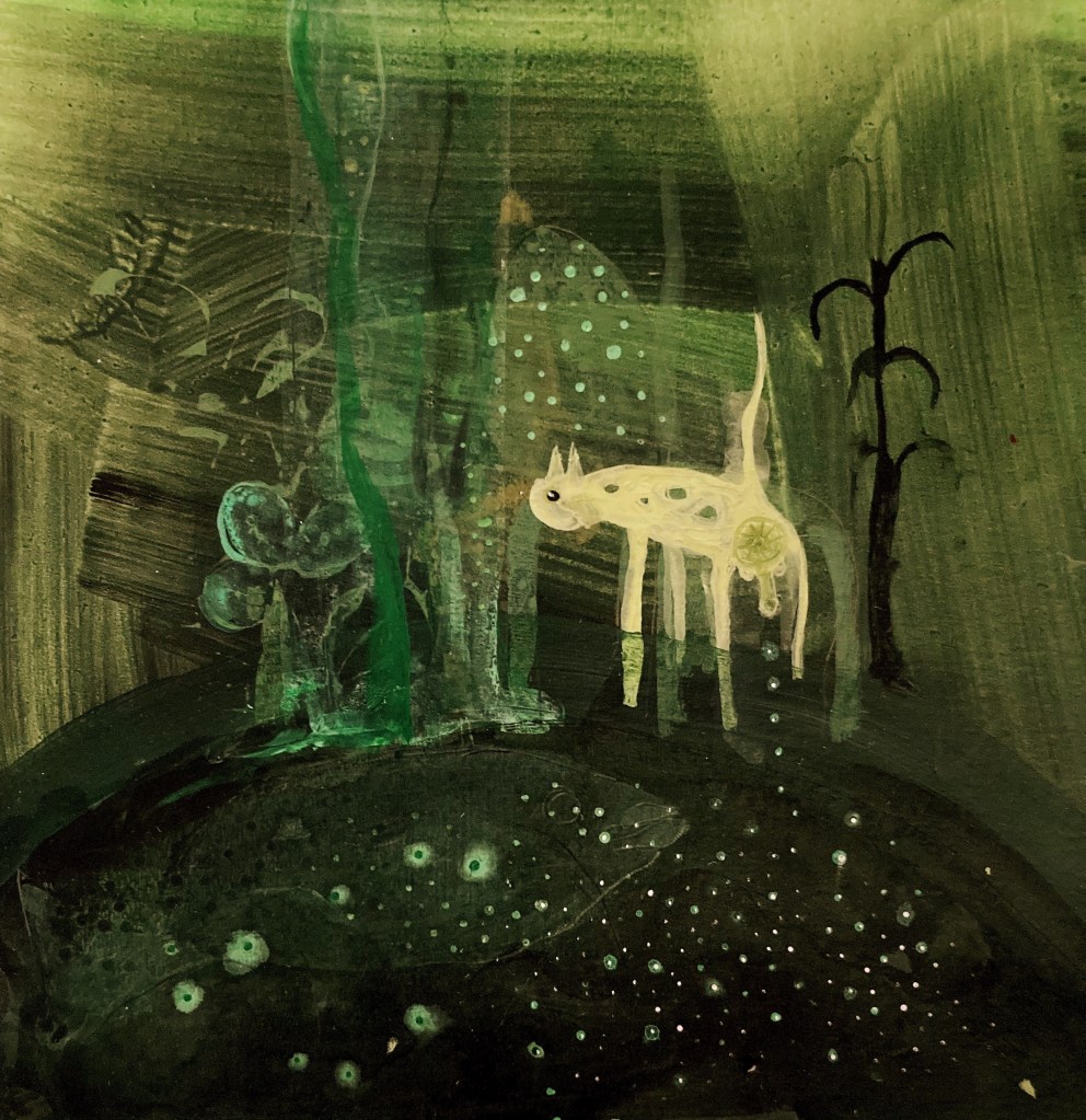
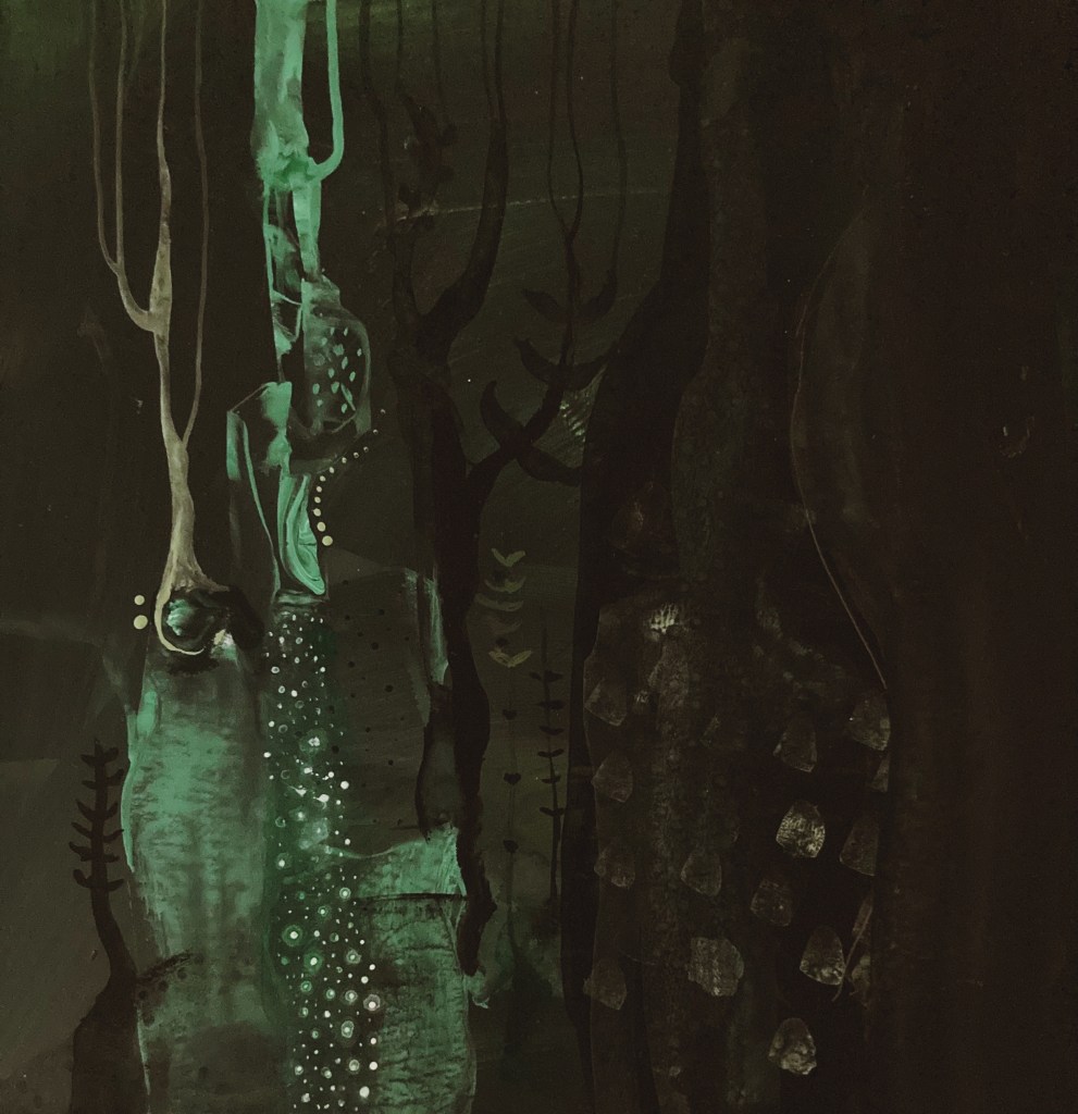
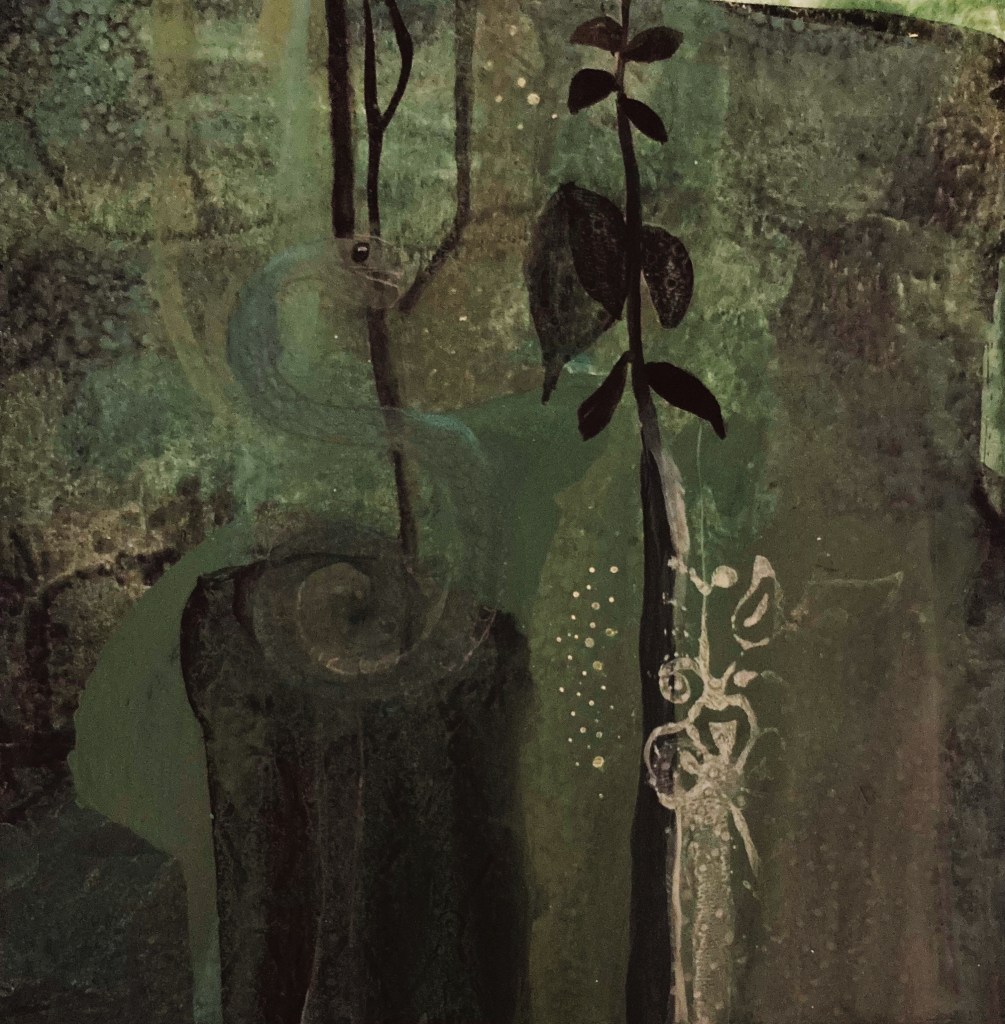
The other day I was lamenting to my fella about the agony I was going through trying to paint my green paintings, one of which I was hoping to get finished for the Interim Show. To clarify, he asked if I meant the paintings that if I didn’t do them there would be absolutely no consequences. That made me laugh so much. Because he was right, not just about the green paintings, but about painting in general. Absolutely nothing of consequence would happen if I never painted another thing. Sure, I’d fail my MA, and have a lot of time on hands, but no one would die, and except for a handful of people, no one in the world would even notice. And yet, I put myself under an inordinate amount of pressure, and approach my painting practice like my life, if not the world, depends on it. This has been true of the green paintings, particularly the one I had in mind for the interim show.

I absolutely love the painting I had in mind for the show, but I have come to the painful conclusion that it simply won’t be finished in time. Because it is a new type of painting for me, there is a certain developmental process that it has to go through, and rushing or missing out aspects of that process has so far resulted in a frustrating, dead-horse-flogging mess. So, before I flog the idea into oblivion, I’m going to return to the beginning of the development process, so I can build a firm foundation for the type of paintings I want to do. In which case, for the next couple of months, I will focus on colour and drawing figures.

During my last one to one tutorial, Jonathan put me onto a brilliant colour theorist, Florent Farges. I’ve already watched one of his videos, and it was extremely helpful, as is his self-designed colour-wheel system, that takes into account hue, chroma, and value. It’s all pretty technical, but I think it will be well worth the time and effort it will take to get to grips with it. So, watching his other videos, studying his wheel/s, and experimenting with colour is high on my list of priorities.

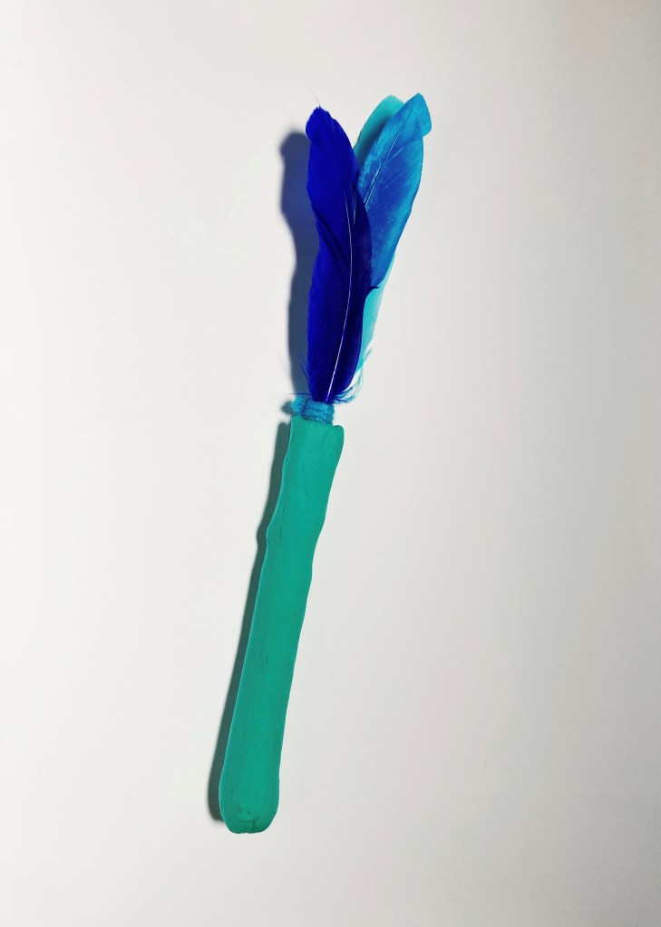
I have also signed-up for a couple of online illustration courses. So far, they have been enjoyable and easy to follow. I don’t want to do realistic drawings, and am not interested in portraiture, but I do want to develop my ability to draw expressive characters which convey emotion.

Instead of showing one of the green paintings at the Interim Show, I am going to show a painting I did when I lived in Australia. I have never shown it before, and very few people have ever seen it. That’s because I hid it in my studio due to what I perceived as a mistake in it. I always thought it was a shame, because apart from that, I thought it was a beautiful painting. Then COVID came along, the world went crazy, and I finally plucked up the courage to paint-out the mistake, and I’m pleased to say it worked, and the painting is now fit to be seen.

Acheron 90cm x 120cm acrylic on board

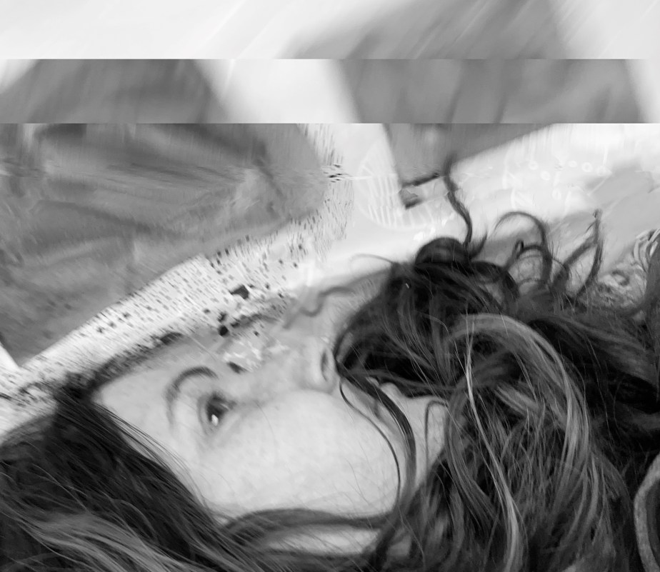
According to Greek mythology, Acheron (lit. river of woe) is the name of one the rivers in the underworld, which, along with the river Styx, Charon ferries the souls of the dead across. It’s an apt title for the painting, as I painted it at a time when I was miserable with unrequited love, an experience that sent my life into a tail-spin of hadesian proportions. Ahh, at least I got this painting out of it. A fair price I think.

I love a good workshop

One of the great things about my MFA course is the variety of workshops that are on offer. I took part in 3 this week, all of which were brilliant. The first two were textile based, and the 3rd, photography. Although my practice is primarily focused on painting, it can be helpful to branch out now and then, as it tends to be easier to loosen up and be more expressive in disciplines you are not so familiar with. The new inspiration you gain from this process can then feed back into your preferred/more practiced discipline.

The first workshop was called ‘Sustainability through textiles‘, which explored the relationship between sustainability and our art practice, specifically in relationship to our masters project. This was perfect for me, as my masters project, about water, naturally has a sustainability aspect. Through a variety of creative/making exercises, we were asked to consider our experience, values, and attitudes towards sustainability.

Below are some things I made during the workshop:

At the end of the workshop, we were asked to consider future actions we might take in our creative practice that demonstrated our values towards sustainability. I concluded that the best thing I could do is pick up the rubbish on the isolated stretch of beach in front of my house, that the sea kindly delivers every hightide. Hardly anyone walks on the beach but me, so I figure it’s my responsibility to keep it rubbish free. Sure I can still creatively express my values if I want, but to do that without picking up the rubbish shows I have no real values at all.

The second workshop was called ‘Emerging dialogues through the positioning of textile and visual arrangements‘. I’m not really sure what that means, but I had a great time. I happened to be the only person taking the workshop, so it was more informal and interactive than usual. I was able to discuss both my water and Ann projects with the tutor, and her feedback was very helpful. I also did all the exercises she’d planned for the class, all of which I found challenging, inspiring, and enjoyable.

Here is one of the things I made (the thing itself is a little naff.. but I do like the photo):

The third workshop was called ‘Finding inspiration: exploring photography through movement‘. I really loved this one. Rather than teaching photography techniques per se, it was more focused on finding ways to access your own creativity. It followed the same structure as the textile workshops, that of instruction, creating/making, and class participation. I found it genuinely inspiring, and will be able to use what I learned, not only to take more interesting photos, but also in my painting practice.

Our main task for the workshop was to take a series of photos of ourselves while moving about. My favourite is the photo below. Even though I was moving when it was taken (as evidenced by my hair falling upwards), there is also a stillness to it that I really like. I also like the one at the top of the post, though it would’ve been better without my phone in the reflection.

As enjoyable as the workshop was, the highlight of the day was going down to the sea during the break and having a surprise visit from Fonzi and his friends. It filled my heart with joy.

Falling into green

Picasso was a horror when it came to women, but his insights into painting were spot on – like this:

Painting isn’t an aesthetic operation; it’s a form of magic designed as a mediator between this strange hostile world and us, a way of seizing the power by giving form to our terrors as well as our desires.

or this:

Colors, like features, follow the changes of the emotions.

I am particularly interested in this second insight at the moment, due to my recent colour change from blue to green. Blue has always felt like a safe, knowable colour to me, which is why I typically used it when experimenting. But green – it is completely different. I don’t yet know its boundaries, or what its emotional resonance will be on a large scale. On a small scale, it feels mysterious and other-worldly, if not a little bit spooky. When I paint with its darker tones (as above), I am reminded of a time when I was a child, in a boat on the edge of a lake. I remember looking deeply into the water which rippled and swirled with tones of impossibly dark green that merged into unknowable inky darkness. I was completely captivated. Even though I was only a small child, probably no more than 5 or 6, I knew I would never forget what I was seeing, and so I never have.

The above picture, which I found on the internet, is the exact colour/visual I remember. Looking at it, even with its poor resolution, I have the same sensation of wanting to fall into its depths. What a truly mysterious colour. However, the trouble with this shade of green is, it doesn’t really go with anything else (perhaps because it is perfection in and of itself), so it would not really be suitable for the figurative painting/s I have in mind for the Interim Show (although, never say never).

One thing is certain, if I am going to paint with green, I have to get it right, or I will end up with a garish mess that no one will want to look at. To avoid this pitfall, I have set myself the task of creating a suitable palette, so I’ll have a better chance of getting it right when it comes to the final work/s.

The eyes have it!

It’s been great to be back at school this week, though its made me acutely aware how quickly time is passing, and how hard I will have to work if I want to make the most of the course and the opportunities before me. Looming large is the Interim Show, which is a college-wide exhibition for first year students, due to take place in the second week of March at the Bouy/Chain Store, Trinity Warf in London. It is a wonderful space/location, and it will be a privilege to show some work there.

I’ve decided I shall align my submission for the show with my aims and objectives for my overall project about water, chief of which is to include figuration (people/creatures) in my work, and also to size-up (i.e. make bigger paintings). Whether I am able to achieve both or either in time for the show, remains to be seen. However, I intend to give it my best shot. To which end, this week I have been working on eyes.

Although I want my peopley-creatures to be quite loose and melt into their surroundings, I would like their eyes to be expressive and convey the emotion of a given painting. Again, it remains to be seen whether this is achievable.

It’s been a wrench to come off the Ann painting in order to focus on the Interim Show (IS) work. I only managed a couple of sessions of the latter this week. However, I’ve now put the Ann painting away for the weekend and intend to only bring it out for my early morning painting session from next week, leaving my other two sessions each day for the IS work.

My daily wanders down to the sea now include a little paddle. Inspired by a massage client who is an ardent Northern Dipper (i.e. a member a wild-swimming group here in the north of the Island), who claimed her daily dips in the sea have changed her life, I decided to get in on the action. However, the stretch of sea I live on is not safe to go swimming in, due to the fierce tidal currents in the vicinity, so I have to content myself with paddling my feet. Holy smokes it’s cold!

To be honest, my first attempt wasn’t very successful. I had left my shoes half-way up the beach, so that when I stopped paddling in the frigid waters, my feet were very tender, and it was too painful to walk across the pebbles to get to them. Never fear, with a bit of Kiwi-ingenuity I managed it.

I thought my first paddling attempt might be my last, until a little while later my feet began to tingle and I had an overall sensation that was quite delightful (my feet are tingling just thinking about it). Needless to say, I have been paddling everyday since. I can now understand why the Northern Dippers are committed to there daily dips, though how they are able to get themselves all the way under is a mystery to me – though I bet they feel amazing afterwards!

Speaking of the Norther Dippers, here is a Pathé inspired video I made about them for a film course I did last year with Berlin Art Institute (note my fella’s amazing narration).

Out of the blue

Typically, blue is the dominant colour in my work. It would be turquoise, which I think is the most beautiful colour in the world, if it weren’t for the fact that too much turquoise is like too much sugar, so, I make do with blue.

But I’m sick of it. Instead, the colour that is hitting my internal “ooo I love that” register, is green. Sure, it’s in the same colour family as blue, and makes up half of a good turquoise, but its completely different to blue, and I am really loving it. There is something deep and mysterious, primordial even, about its darker versions, and there is such a wonderful array of its lighter variations, that I feel I could explore it for a while. So, I’m going to.

Here are a few initial experiments: