No.65 – This painting felt like another breakthrough. I can really see the potential in this kind of work. Painting bigger definitely allows for more detail. This is a very exciting process. Sea underpainting.
Tuesday, 6th June
No.66No.67
No.66 – This is a sea-painting on canvas (30cm x 30cm) – just trying different things. This type of painting takes well to canvas, which is good.
No.67 – Another sea-painting (on paper). Rather than paint an entire big painting just yet, thought I’d do close-ups of certain aspects. Again, I like the amount of detail that can be used in bigger work.
Wednesday, 7th June
No.68No.70No.69
No.68-70 – These were some unfinished small paintings I had lying around, so I finished them off. I like aspects of them, but it’s definitely more enjoyable painting bigger.
Thursday, 8th June
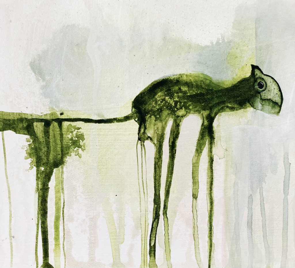
No.71
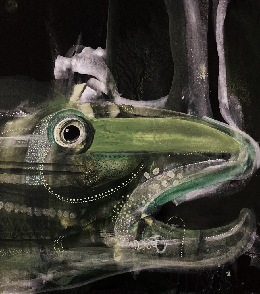
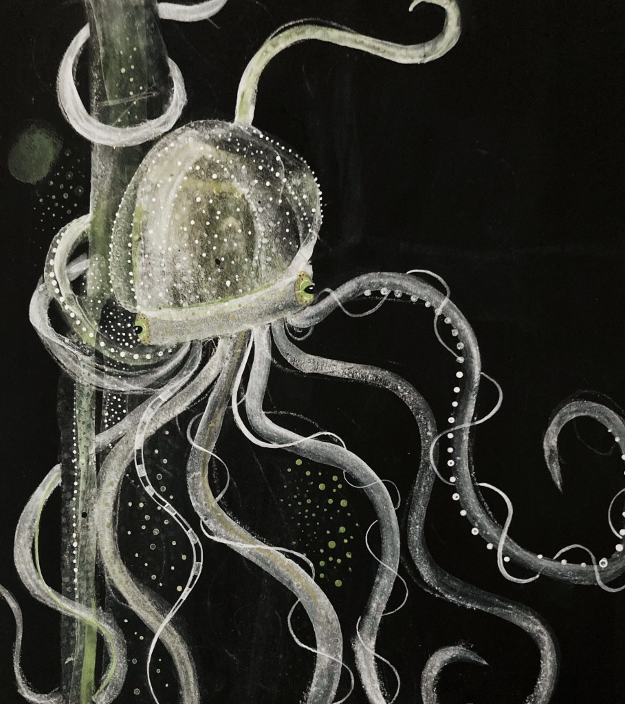
No. 71 – This is another painting I had lying around. It was initially of something different. The only part I liked was what is now the octopus’ head – so I kept that and painted out the rest and added the tentacles. It was pleasant to paint.
Friday, 9th June
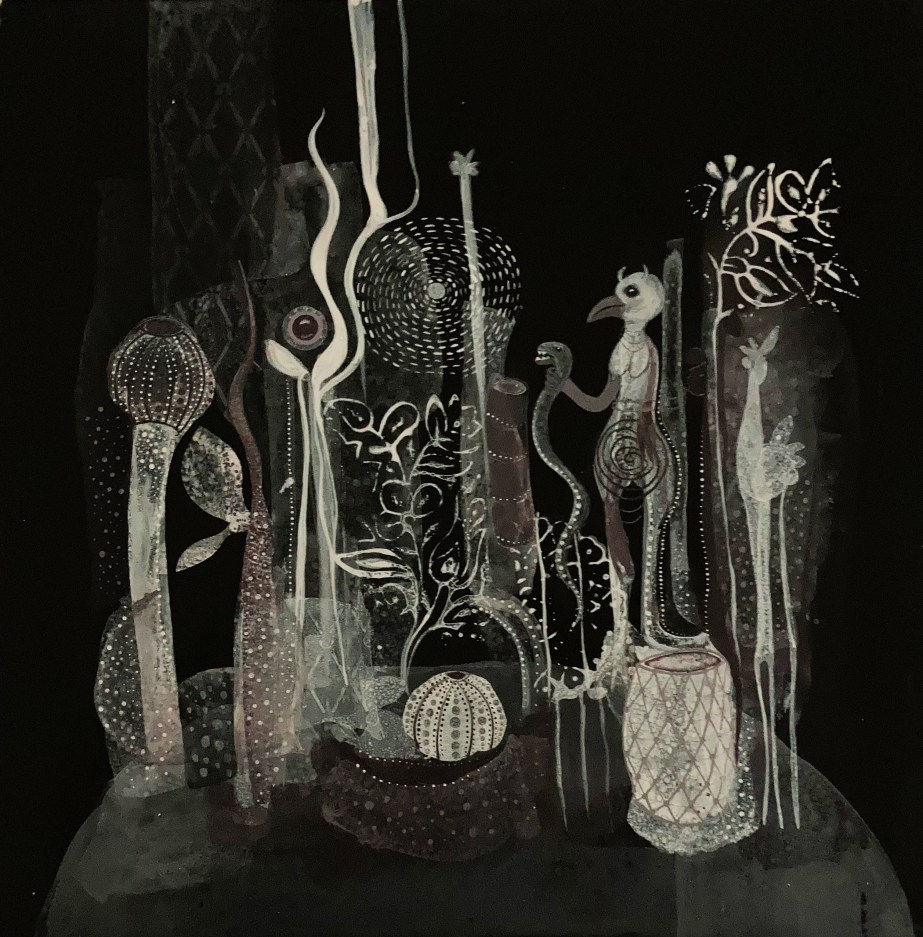
No.72
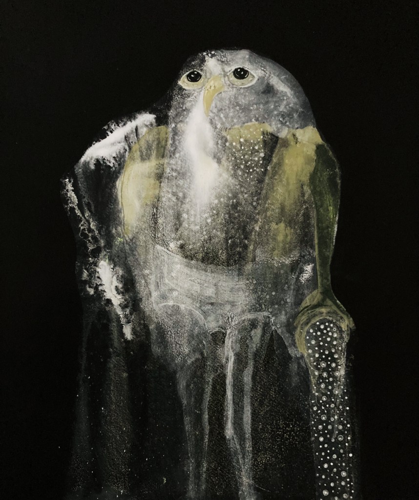
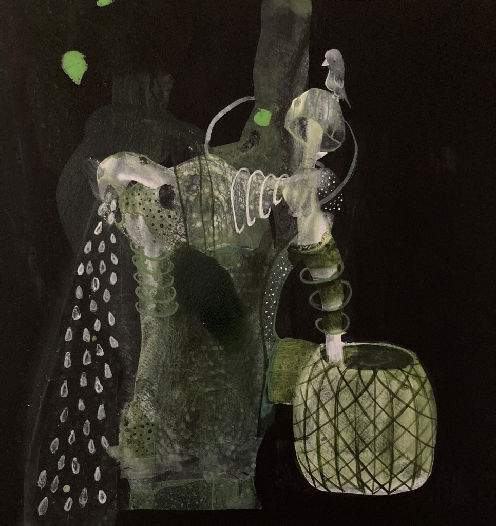
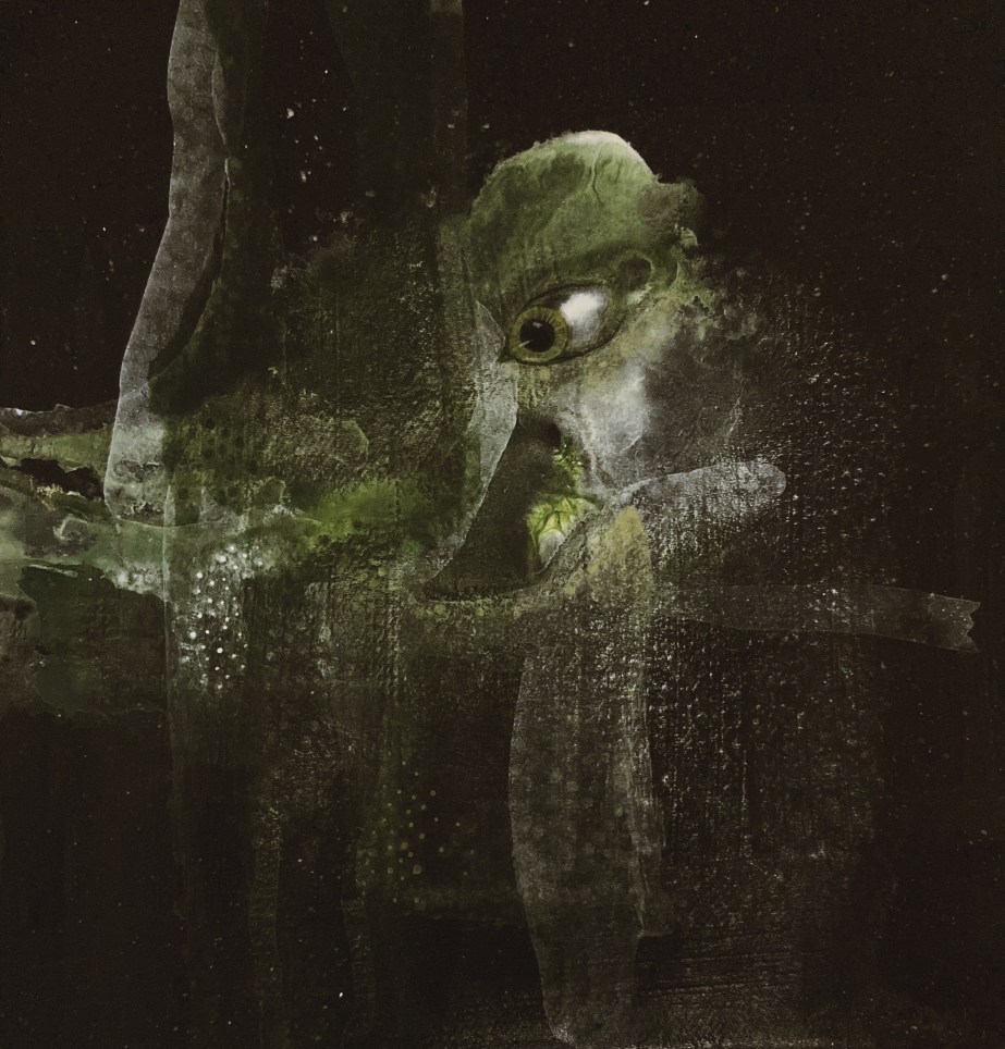
No.72 – I spent the morning at a pre-op appointment with my Mum, for her hip replacement, so I painted this in the afternoon. Rather than a sea underpainting, this underpainting was done by spraying seawater. I love this painting. I’ve often thought that the white in these dark paintings look like bone. The lace overlay is another breakthrough – I’m thrilled it looks great with these paintings. I will definitely explore these two elements (bones and lace) in the coming days.
Sunday, 11 June
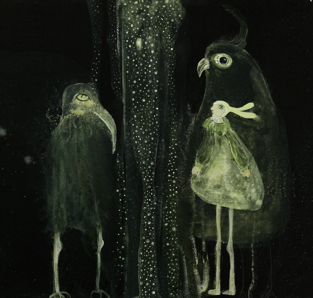
No.73No.74
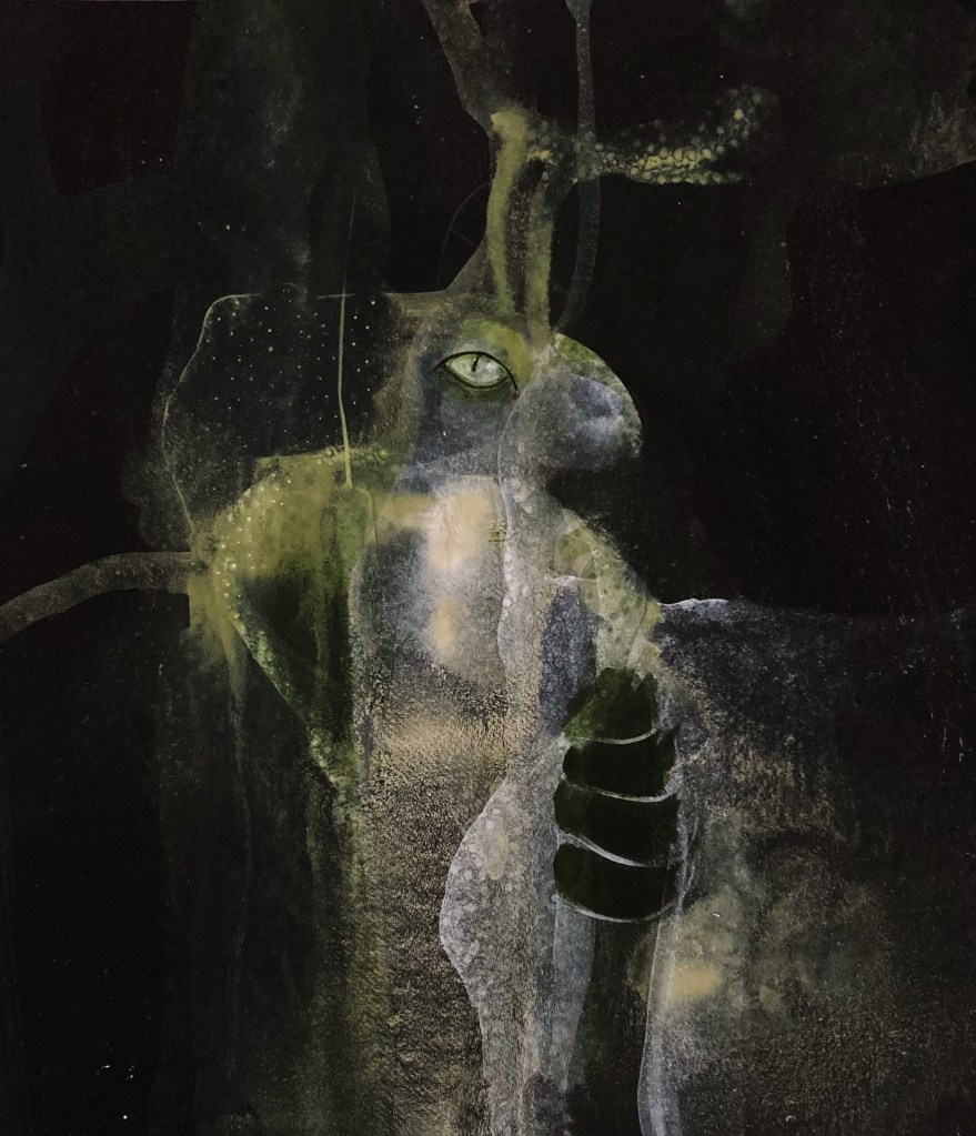
No.73-74 – In these paintings I was exploring the lace overlay further (minus the bones), I absolutely love the results. I especially love how the underpainting shows through, giving the effect that the lace is see-through. There’s a deep connection between lace and the sea for me. I also think it adds a mystical aspect to the paintings, plus it is a pleasure to paint – so it’s a win all round!
I have new neighbours, Kylie and Jason and their little baby, Harold. They live in the Point of Ayre foghorn. I realised Kylie and Jason had a chick a couple of evenings back when I heard him squawking inside a hollow in the foghorn. Then last night, my fella and I saw Harold for the first time, it was beyond exciting. I wasn’t able to get a photo of Harold, as we didn’t want to get too close, but here is some footage I managed to get of Kylie and Jason last week.
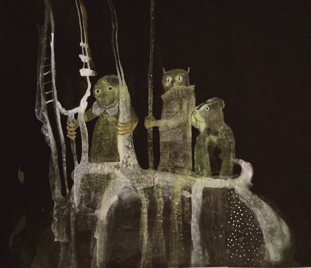
The painting breakthroughs kept coming this week. A distinct style for the green paintings is emerging, and I love it. I feel like I have been given a small glimpse of what the paintings can be, and although I take nothing for granted, and realise there is still a possibility I can’t pull them off, I have reason to be hopeful.
The main focus again has been painting bigger. With the drawing practice I have been doing, it has proved much easier than I thought it would be. It’s also far more interesting painting bigger, as it allows for more detail.
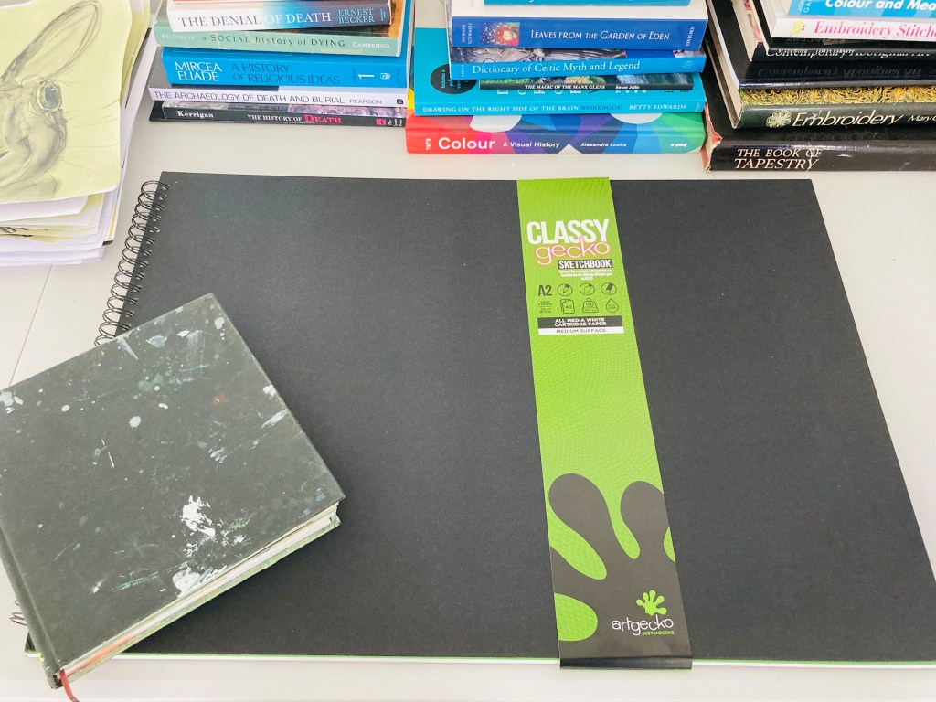
To help with the bigger drawings, I bought a ginormous sketchbook, and so far I have found drawing big just as easy as drawing small.
I have also started a daily reading discipline, without which I would never get through all the books/papers I have to read for my research paper this summer. Don’t feel too sorry for me though, as this is where my reading discipline takes place.
No.53&55 – With these paintings, I was seeing what it is like to paint out some of the marks with black. These didn’t have the sea underpaintings, hence they are a little wooden. Still, I like aspects of both, like the knickers on 55, and the detailing on 53.
Tuesday, 30th May
No.54 (something went awry with the numbering) Just another experiment, trying different things.
Wednesday, 31st May
No.56-57 – I decided to take a break from the the green/figurative paintings. As I mentioned before, I’d like to develop these into landscapes. I am very inspired by the walks I have been taking in the Ayres this week, of which this type of painting is a product of. The idea etc., still has a way to go.
Thursday, 1st June
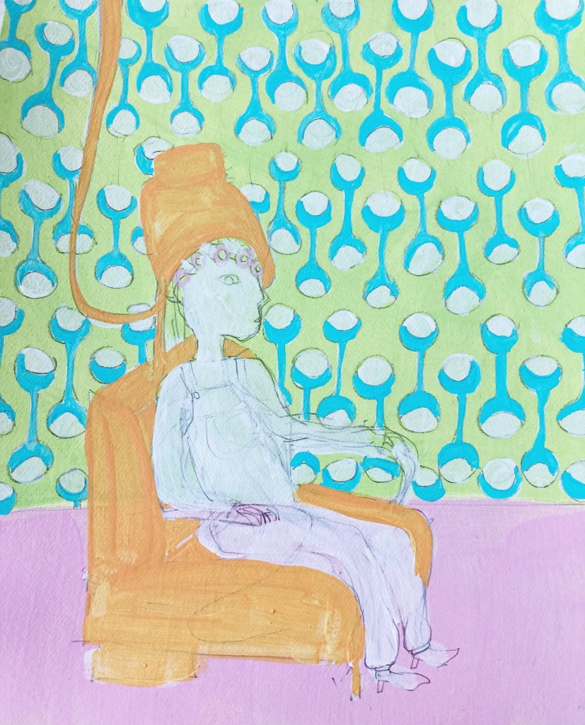
No.58-60 – these are experiments for another idea I have had, which includes interiors with patterned wallpaper. This idea is still at an early stage. As with the landscape paintings, these are a nice break from the figurative ones.
Friday, 2nd June
No.61 – here I tried the landscape type painting on canvas. I definitely think this kind of work could develop into something beautiful.
Sunday, 4th June
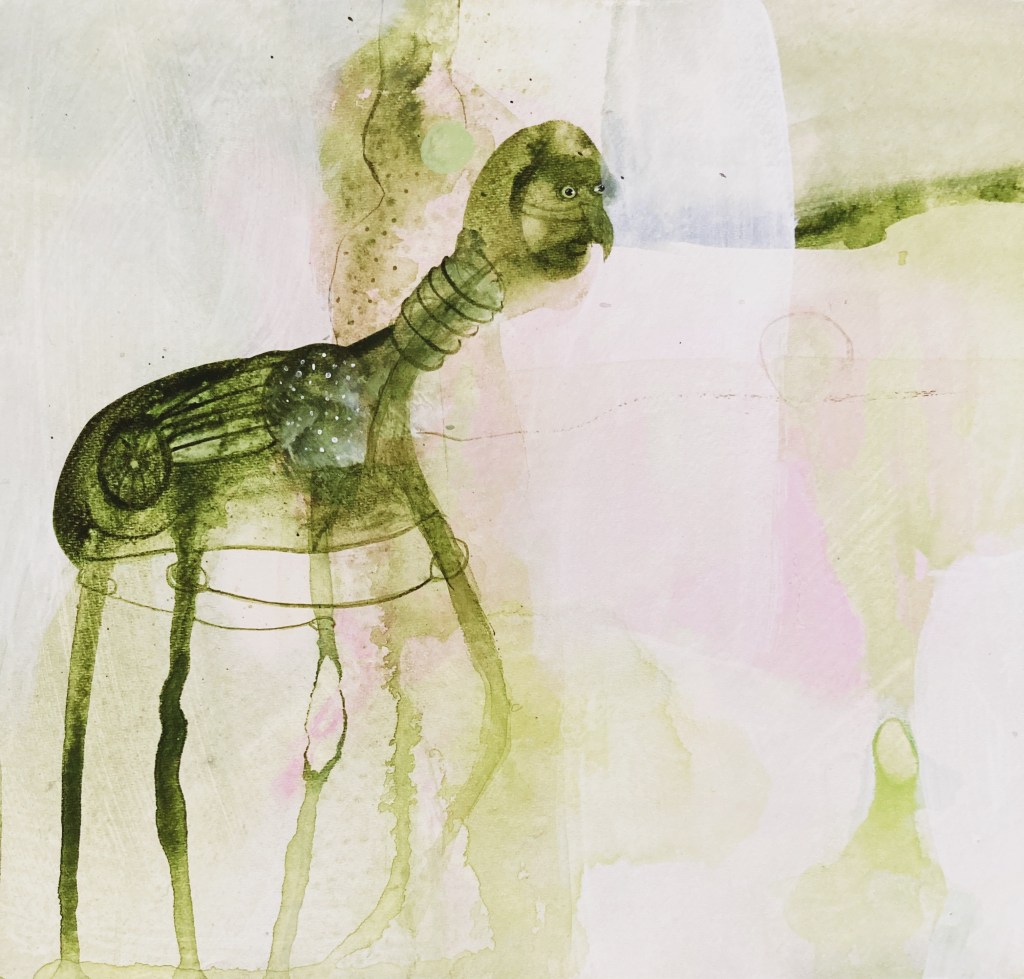
No.62-63 – back to the green/figurative paintings, which is a pleasure after having a wee break from them. Just trying different things. I’ve added phthalo green (blue shade) to these, and really like the results. The y also have sea-underpaintings, which makes them more dynamic. I came to the realisation this week, that if I want to paint bigger I have to draw bigger. So, for the paintings, I’m going to try painting particular aspects on a larger scale (such as the eye above). I am delighted with the amount of detail you can add when you paint bigger.
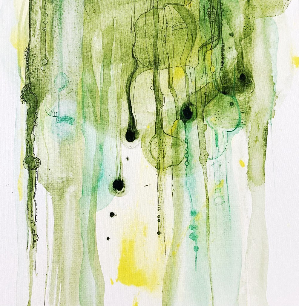
No.42 – I started using a new technique – applying random marks on the paper, then spraying water on them, and letting the images emerge organically out of the marks, then painting into them. I love the results.
No.43 – I love this little painting.
Tuesday, 23rd May
No.44No.45No.46
No.44-46 – Some experiments using the same same technique on a lighter ground. I’ll keep experimenting with various ground colours, but so far I prefer the dark ground.
Wednesday, 24th May
No.47No.48
No.47-48 – more experiments, with less and more drawing respectively. I feel there is quite a bit of scope for these paintings.
Thursday, 25th May
No.49No.50
No.49-50 – these are heading more in the direction I want to go, its getting the balance between form and abstraction right. I love the palette of these.
Friday, 26th May
No.51
No.51 – This was my breakthrough piece this week. I love everything about it. I want to continue exploring this kind of painting, with the grand aim of scaling up.
Saturday, 27th May
No.52 – I thought I take a break from the figurative paintings this weekend, and instead explore this lace-bubble technique further, which is for a different project. The more opaque centre-right bubble was done with an a gel-pen drawing underneath, the rest were painted directly. I much prefer the latter. The aim of the experiment is to see what the lace-bubbles look like covering the entire surface of a painting. Unfortunately, the underpainting of this one isn’t very good, as I rushed it, and the paper doesn’t suit this kind of painting (which is much better suited to fine-grain canvas/linen), still, it will give me an idea of what the coverage looks like.
I had a painting breakthrough this week, which is always a double-edged sword. On the one hand there was a huge sense of excitement and relief, like I am finally getting somewhere and all my previous hard work on this particular project appears not to be in vain. On the other hand, it’s like the bear in the children’s song who reaches the top of the mountain, and what does it see? Another mountain! That’s exactly how it felt, I was momentarily thrilled at the progress I made and the paintings I produced, but I was soon brought back to earth when I realised how far I still have to go to achieve the paintings I want to.
The paintings I did this week are just little snippets of what I hope to be much larger paintings. Scaling up is no easy task, and when it comes to figurative painting, I am yet to manage it, but I will surely to keep trying. One thing is certain after the week I’ve had, the drawing discipline I started at the beginning of the year is definitely paying off.
I’ve also been busy this past week writing the overview of my research paper, so our tutor can see what we intend to write about and give us feedback and guidance. I decided to do mine on the Ars Moriendi, the medieval dying how-to-manual that I mentioned in my last post. It hurt the old brain cells to do, but it was definitely worthwhile, as I now have a clear direction for the paper, which will make it much easier to write over the summer. I actually think I’ll enjoy writing it, as it is a fascinating subject, and has already sparked some interesting conversations with friends and family.
You can read my overview here if you have the time and/or inclination.
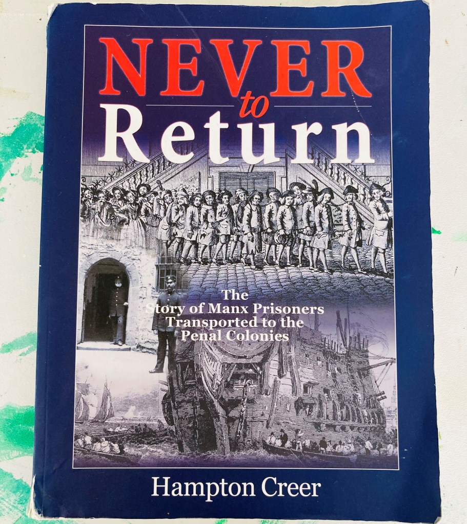
In other news, my fella and I have decided to make a documentary about Ann’s story. To begin the process, we had a pre-interview meeting with Hampton Creer, the author of “Never to Return”. It was such a privilege to meet him and his lovely wife Joy.
I absolutely love his book, it is beautifully written, and is a page turner from start to finish. It was also very special, because it was from his book that I first learned about Ann and was inspired to do a painting about her. We had a wonderful time talking all about penal transportation and other aspects of Manx history, such as witches. Once the TT races are over in a couple of weeks, my fella and I will return and interview him on camera.
I love dots. I love seeing them and I love putting them in my paintings. Nearly all my paintings have at least a little bunch or line of dots. In fact, most have lots of dots, and there are some that are completely covered in them. Dots are a pleasure to paint and are like sugar for my eyes. Basically, I can’t get enough of them.
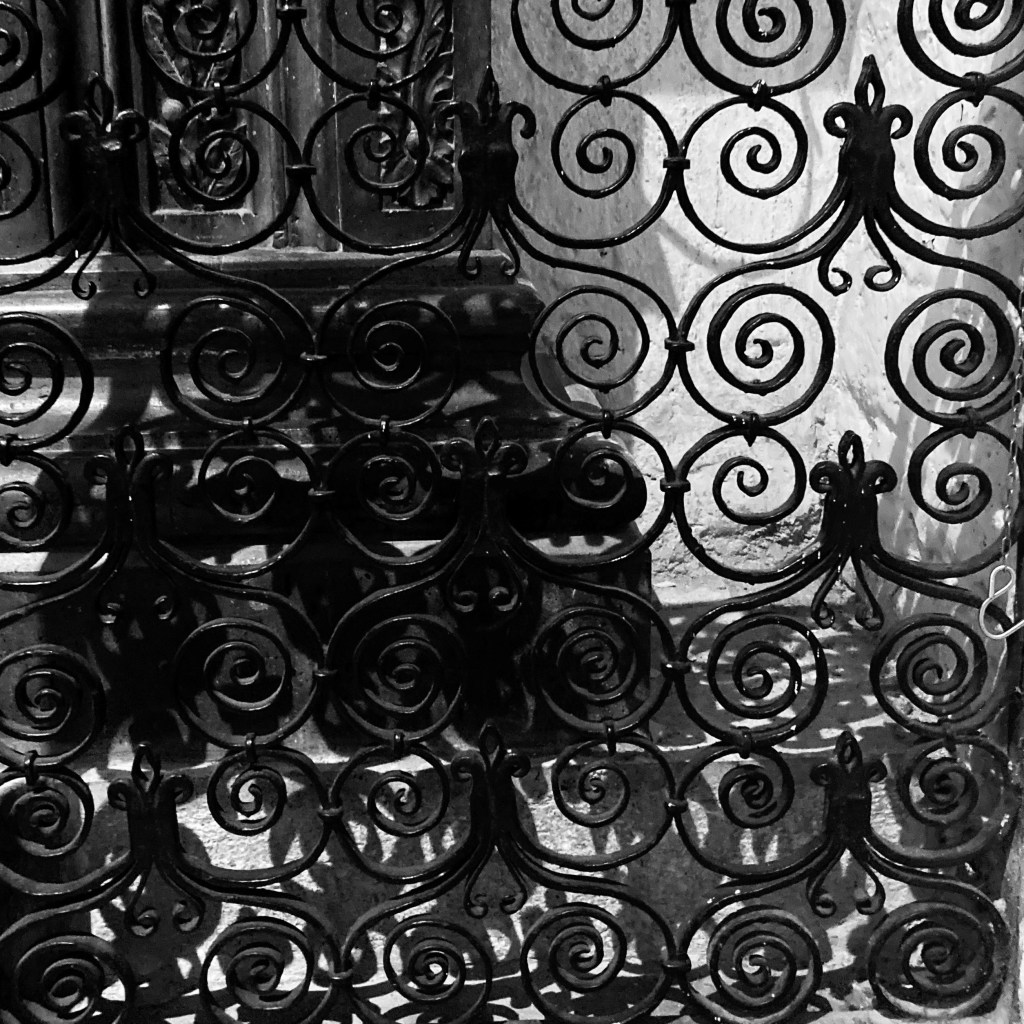
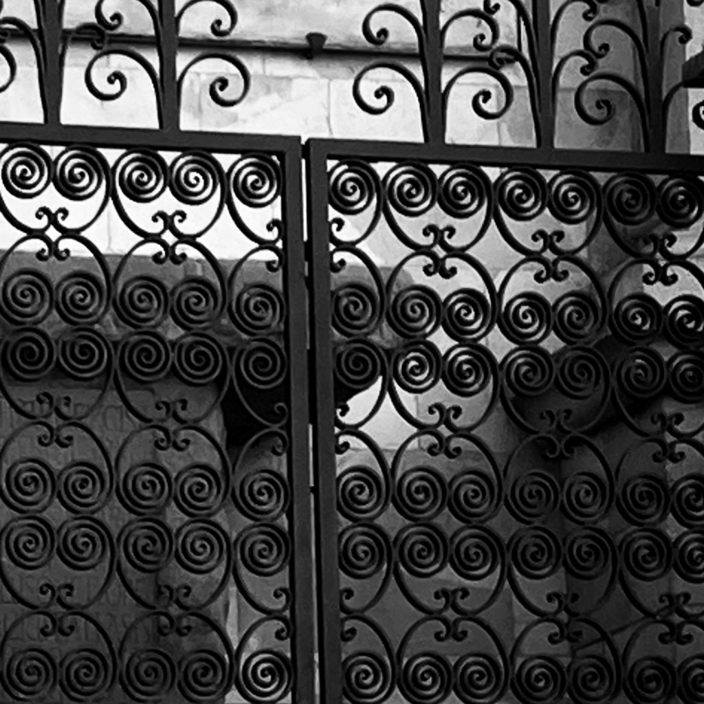
Another thing I love are patterns. Whether in nature or by human hand, seeing a pattern makes my heart happy. If coupled with symmetry, as any self-respecting pattern is, then I am compelled to stop and stare, and invariably take a photo. For this reason, I have more photos of the spectacular wrought-iron work I saw on our recent holiday to Tuscany, than of the stunning scenery. Just ask my fella, he had to stop and hold my handbag every time I saw a lattice, and practically every house in the hill-top medieval towns we visited had them.
The beauty of the lattice-work I saw, inspired me to begin including it my paintings, which I did for a series I painted while at the Royal College of Art Summer School. I think it’s probably best not to over do it, but I little here and there looks lovely.
For the green paintings I’m doing for my first research project, I’d like to include more complex pattern work. So this past week, I have been experimenting with patterns from Victorian wallpaper. I like the results so far. When I am in London next week, I will try and visit the Victoria and Albert Museum to find some more inspirational patterns.
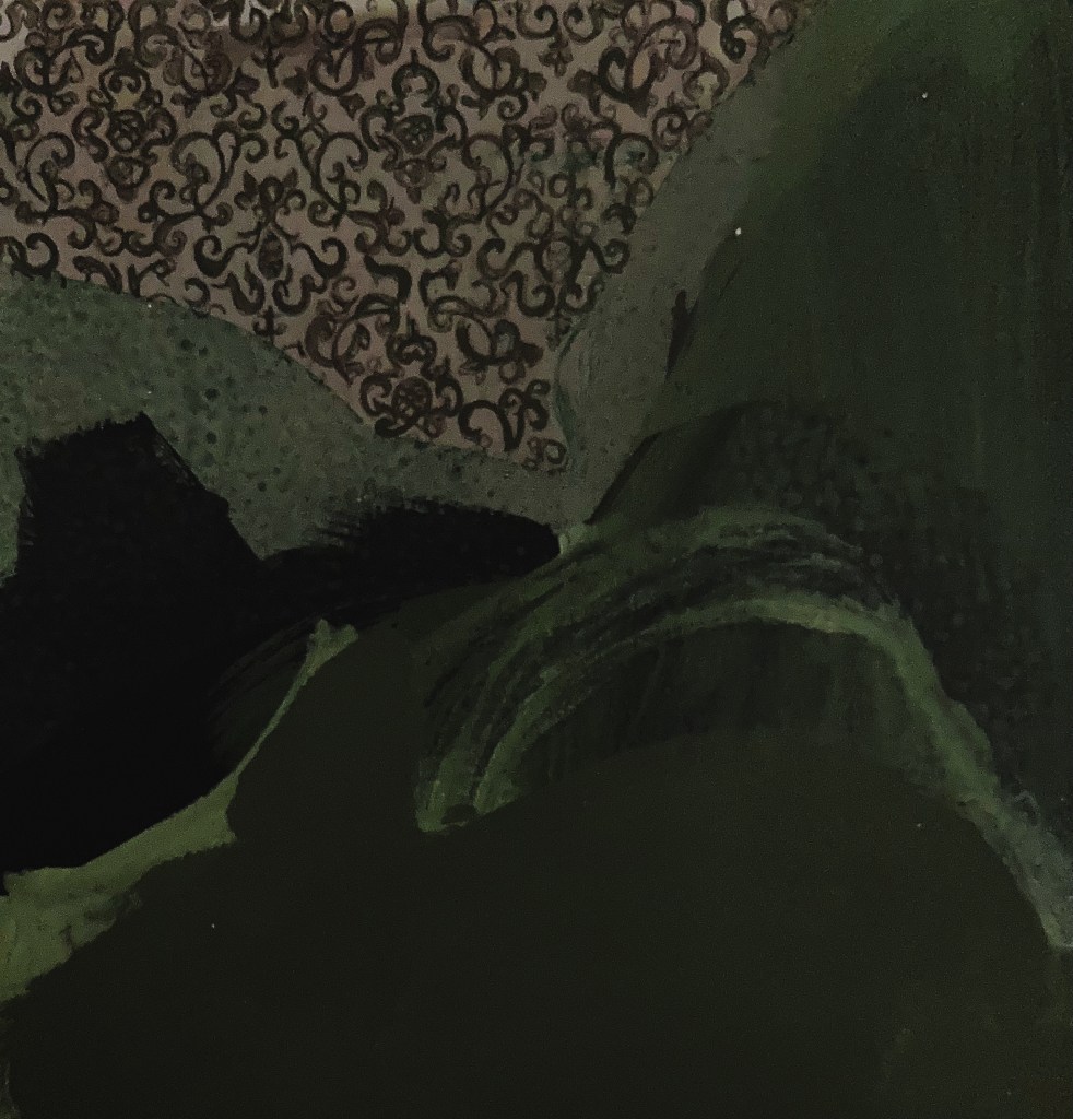
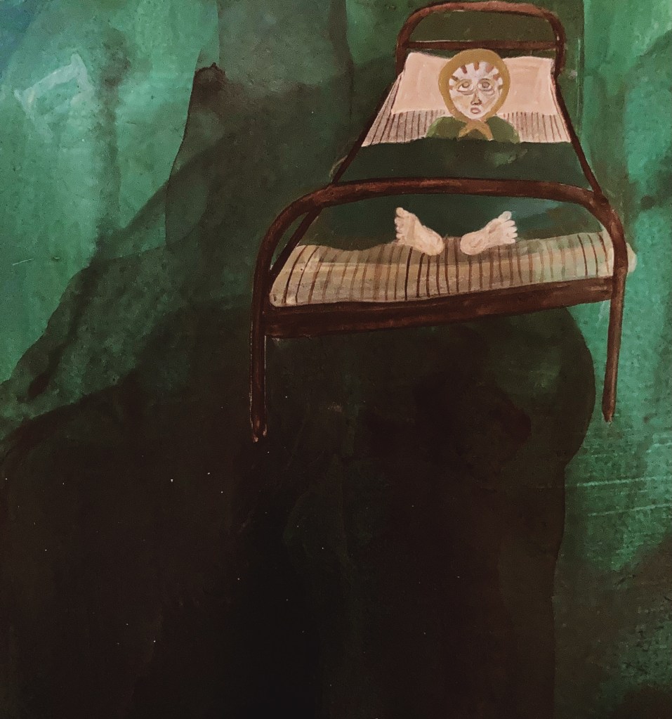
I love a good nap. And by far the best napping I have ever done was in my dead-lady-bed. The bed was a fixture in my last apartment, which I rented for 12 years (the longest I’ve lived anywhere). It got its dead-lady moniker because I am convinced an old lady died in it. It was a single, motorised bed that moved up and down, like you find in an old-folks home, and had a mattress so insanely comfortable, that even though I now sleep in a fancy super-king bed with a memory-foam mattress, I still find myself hankering for the warm embrace of my dead-lady-bed.
Coincidently (or perhaps not), the painting I had in mind for the Interim Show featured a dead lady in a bed. Although I wasn’t able bring the whole concept of the painting to fruition in time (of which the dead-lady-in-a-bed was just one element), it certainly wasn’t for want of trying.
Even though the painting doesn’t yet exist in its final form, I love it with a passion, and will do everything within my artistic powers to make it exist. Seeing the little experiments above gives me heart that it will!
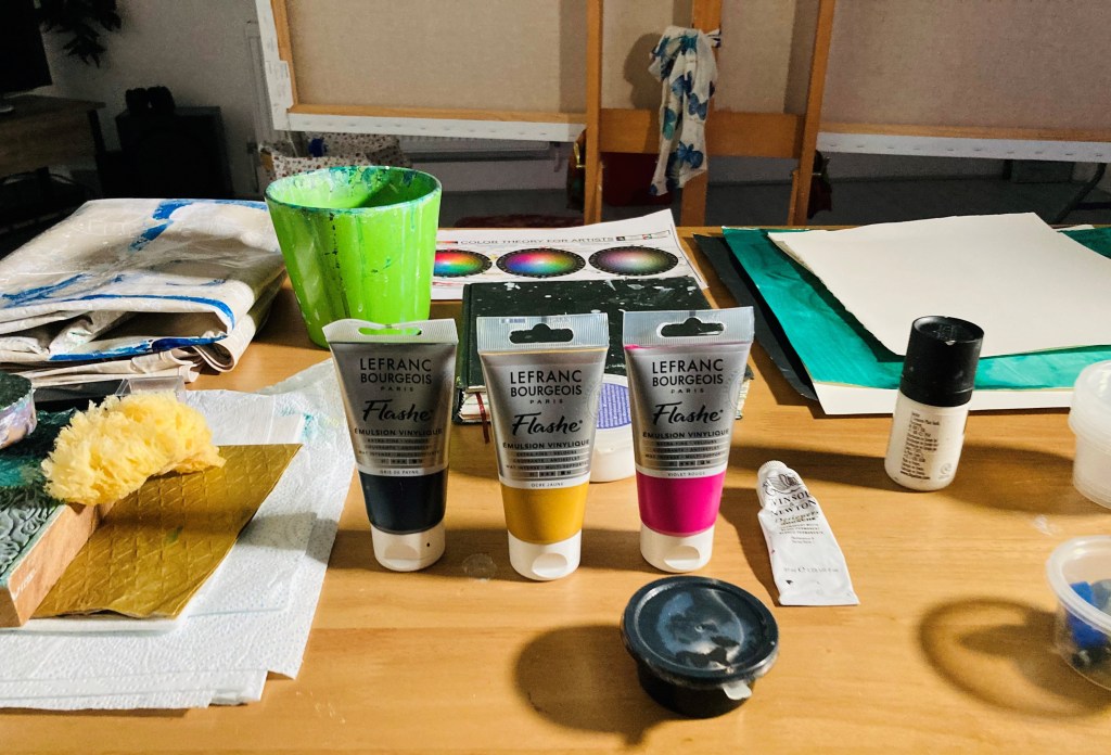
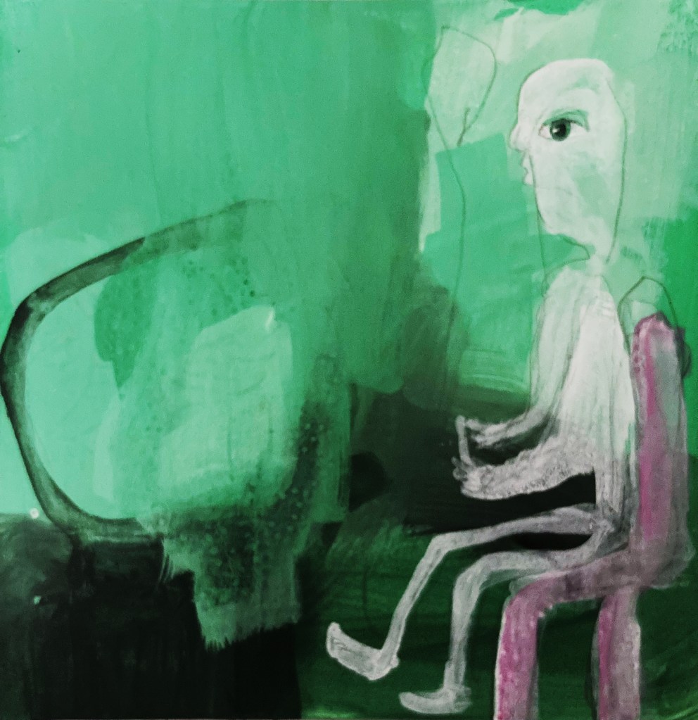
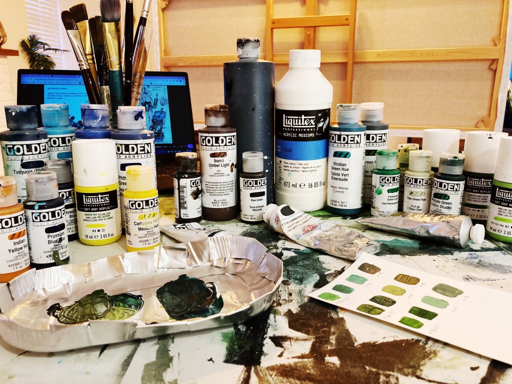
After getting myself in a right pickle with my interim show painting, and almost flogging it into oblivion, I decided to take a more simple approach to the green paintings. My main focus at the moment is colour. Using the colour wheel I mentioned in my last post, I set myself the task of mixing my own greens using two colours, and then adding black and white to create different tones. I then added a colour on the opposite side of the wheel, known as a complimentary colour, and painted some little paintings to explore the colours and tones I created.
For my first experiments, I used phthalo green (blue shade) and yellow light, with red violet as the complimentary. It was nice not to have the pressure of creating an actual painting, and because I wasn’t trying so hard, some little paintings did pop out. The lighter tones are too bright and minty for the underwater paintings I have in mind, although they might be good for the odd highlight here and there. I really like the darker tones, and will definitely keep them in my bag of tricks. I also think it works better when the complimentary colour is quite strong, as in the painting below (which is of my fella playing Destiny and losing his hair from the stress of it).
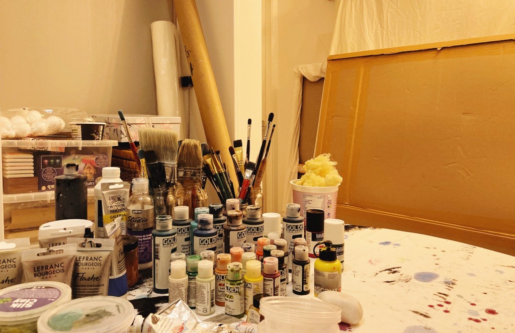
Last week I decided to declutter the studio. Wow, what a difference it makes. I love being in here even more now, and find it much more conducive to arting. Of course, unless you’re a de-clutterer of the ruthless variety, the clutter has to go somewhere. Mine has gone into the room that my fella was going to use as an office. However, the non-fibre broadband we have out here in the woop woops isn’t good enough for his job, so he still works in his flat in Ramsey. With the empty space too tempting not to fill, it is now home to canvases and paints and things. According to my fella, I have now peed in every corner of the house, and if we ever do get fibre out here, he’ll need to water-proof the shed.
The other day I was lamenting to my fella about the agony I was going through trying to paint my green paintings, one of which I was hoping to get finished for the Interim Show. To clarify, he asked if I meant the paintings that if I didn’t do them there would be absolutely no consequences. That made me laugh so much. Because he was right, not just about the green paintings, but about painting in general. Absolutely nothing of consequence would happen if I never painted another thing. Sure, I’d fail my MA, and have a lot of time on hands, but no one would die, and except for a handful of people, no one in the world would even notice. And yet, I put myself under an inordinate amount of pressure, and approach my painting practice like my life, if not the world, depends on it. This has been true of the green paintings, particularly the one I had in mind for the interim show.
I absolutely love the painting I had in mind for the show, but I have come to the painful conclusion that it simply won’t be finished in time. Because it is a new type of painting for me, there is a certain developmental process that it has to go through, and rushing or missing out aspects of that process has so far resulted in a frustrating, dead-horse-flogging mess. So, before I flog the idea into oblivion, I’m going to return to the beginning of the development process, so I can build a firm foundation for the type of paintings I want to do. In which case, for the next couple of months, I will focus on colour and drawing figures.
During my last one to one tutorial, Jonathan put me onto a brilliant colour theorist, Florent Farges. I’ve already watched one of his videos, and it was extremely helpful, as is his self-designed colour-wheel system, that takes into account hue, chroma, and value. It’s all pretty technical, but I think it will be well worth the time and effort it will take to get to grips with it. So, watching his other videos, studying his wheel/s, and experimenting with colour is high on my list of priorities.
I have also signed-up for a couple of online illustration courses. So far, they have been enjoyable and easy to follow. I don’t want to do realistic drawings, and am not interested in portraiture, but I do want to develop my ability to draw expressive characters which convey emotion.
Instead of showing one of the green paintings at the Interim Show, I am going to show a painting I did when I lived in Australia. I have never shown it before, and very few people have ever seen it. That’s because I hid it in my studio due to what I perceived as a mistake in it. I always thought it was a shame, because apart from that, I thought it was a beautiful painting. Then COVID came along, the world went crazy, and I finally plucked up the courage to paint-out the mistake, and I’m pleased to say it worked, and the painting is now fit to be seen.
Acheron 90cm x 120cm acrylic on board
According to Greek mythology, Acheron (lit. river of woe) is the name of one the rivers in the underworld, which, along with the river Styx, Charon ferries the souls of the dead across. It’s an apt title for the painting, as I painted it at a time when I was miserable with unrequited love, an experience that sent my life into a tail-spin of hadesian proportions. Ahh, at least I got this painting out of it. A fair price I think.
Picasso was a horror when it came to women, but his insights into painting were spot on – like this:
Painting isn’t an aesthetic operation; it’s a form of magic designed as a mediator between this strange hostile world and us, a way of seizing the power by giving form to our terrors as well as our desires.
or this:
Colors, like features, follow the changes of the emotions.
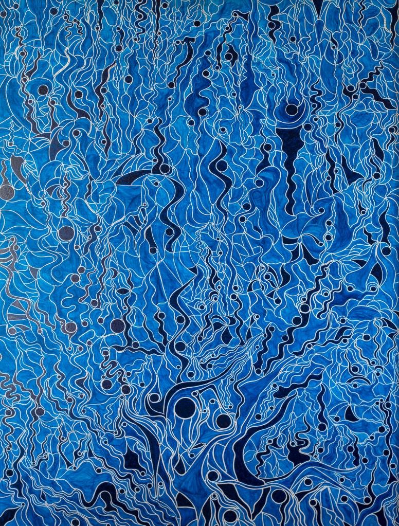
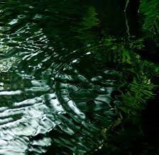
I am particularly interested in this second insight at the moment, due to my recent colour change from blue to green. Blue has always felt like a safe, knowable colour to me, which is why I typically used it when experimenting. But green – it is completely different. I don’t yet know its boundaries, or what its emotional resonance will be on a large scale. On a small scale, it feels mysterious and other-worldly, if not a little bit spooky. When I paint with its darker tones (as above), I am reminded of a time when I was a child, in a boat on the edge of a lake. I remember looking deeply into the water which rippled and swirled with tones of impossibly dark green that merged into unknowable inky darkness. I was completely captivated. Even though I was only a small child, probably no more than 5 or 6, I knew I would never forget what I was seeing, and so I never have.
The above picture, which I found on the internet, is the exact colour/visual I remember. Looking at it, even with its poor resolution, I have the same sensation of wanting to fall into its depths. What a truly mysterious colour. However, the trouble with this shade of green is, it doesn’t really go with anything else (perhaps because it is perfection in and of itself), so it would not really be suitable for the figurative painting/s I have in mind for the Interim Show (although, never say never).
One thing is certain, if I am going to paint with green, I have to get it right, or I will end up with a garish mess that no one will want to look at. To avoid this pitfall, I have set myself the task of creating a suitable palette, so I’ll have a better chance of getting it right when it comes to the final work/s.