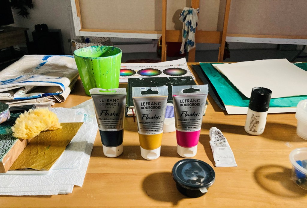
After getting myself in a right pickle with my interim show painting, and almost flogging it into oblivion, I decided to take a more simple approach to the green paintings. My main focus at the moment is colour. Using the colour wheel I mentioned in my last post, I set myself the task of mixing my own greens using two colours, and then adding black and white to create different tones. I then added a colour on the opposite side of the wheel, known as a complimentary colour, and painted some little paintings to explore the colours and tones I created.

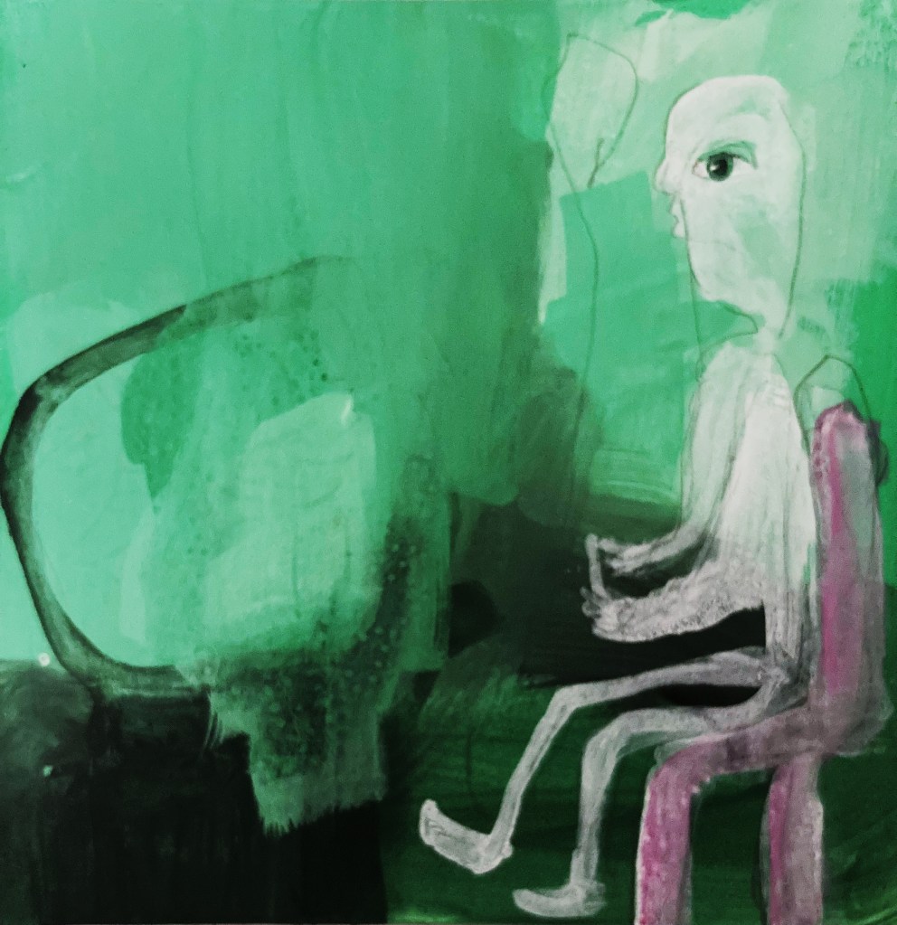
For my first experiments, I used phthalo green (blue shade) and yellow light, with red violet as the complimentary. It was nice not to have the pressure of creating an actual painting, and because I wasn’t trying so hard, some little paintings did pop out. The lighter tones are too bright and minty for the underwater paintings I have in mind, although they might be good for the odd highlight here and there. I really like the darker tones, and will definitely keep them in my bag of tricks. I also think it works better when the complimentary colour is quite strong, as in the painting below (which is of my fella playing Destiny and losing his hair from the stress of it).

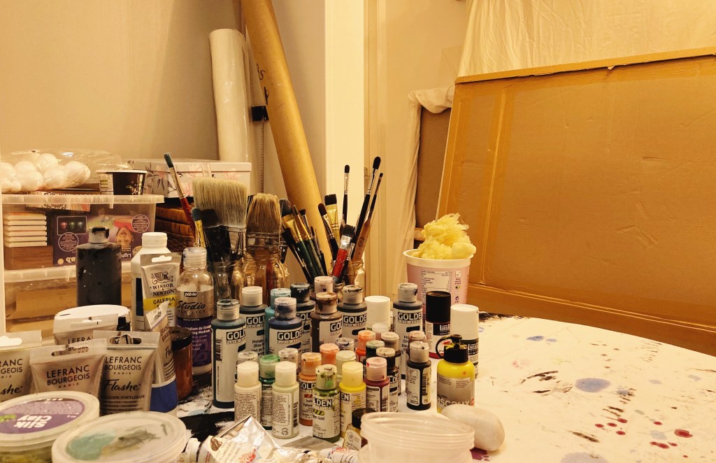
Last week I decided to declutter the studio. Wow, what a difference it makes. I love being in here even more now, and find it much more conducive to arting. Of course, unless you’re a de-clutterer of the ruthless variety, the clutter has to go somewhere. Mine has gone into the room that my fella was going to use as an office. However, the non-fibre broadband we have out here in the woop woops isn’t good enough for his job, so he still works in his flat in Ramsey. With the empty space too tempting not to fill, it is now home to canvases and paints and things. According to my fella, I have now peed in every corner of the house, and if we ever do get fibre out here, he’ll need to water-proof the shed.
