
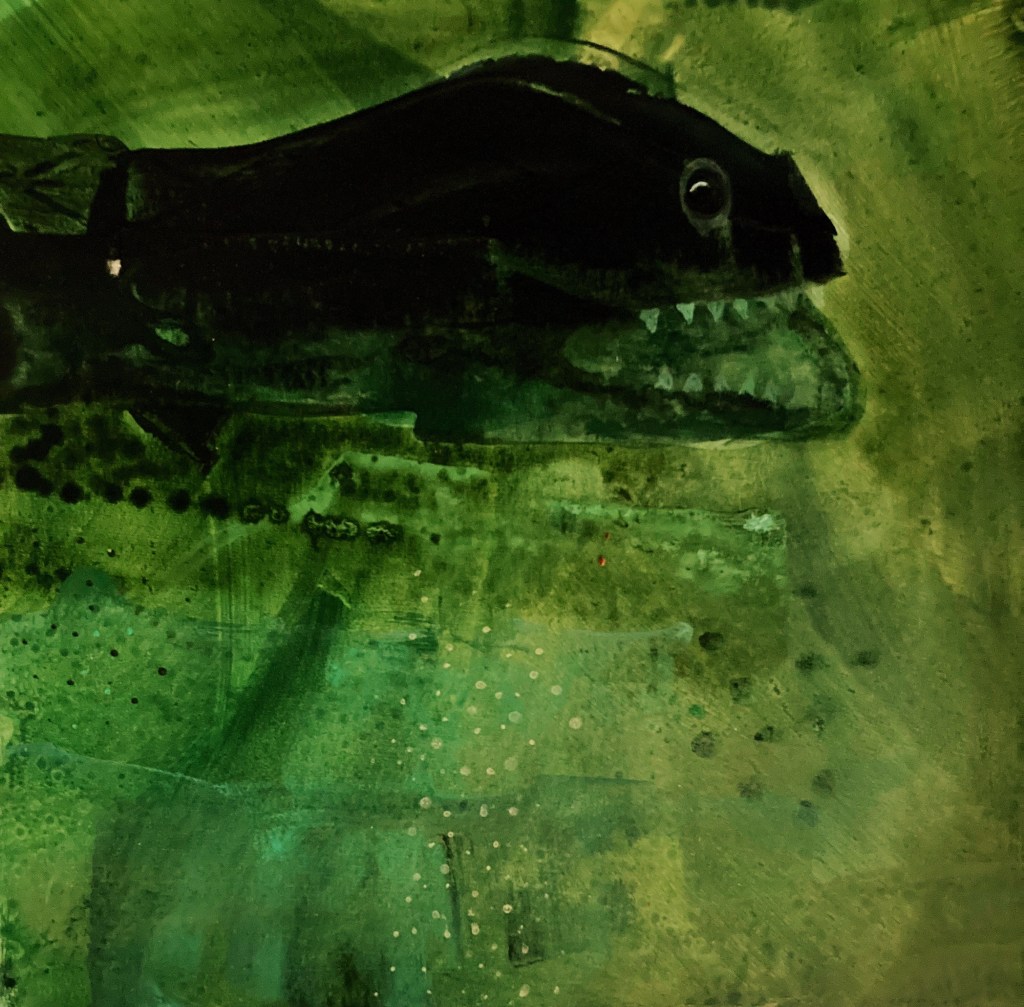
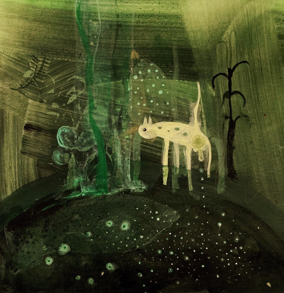
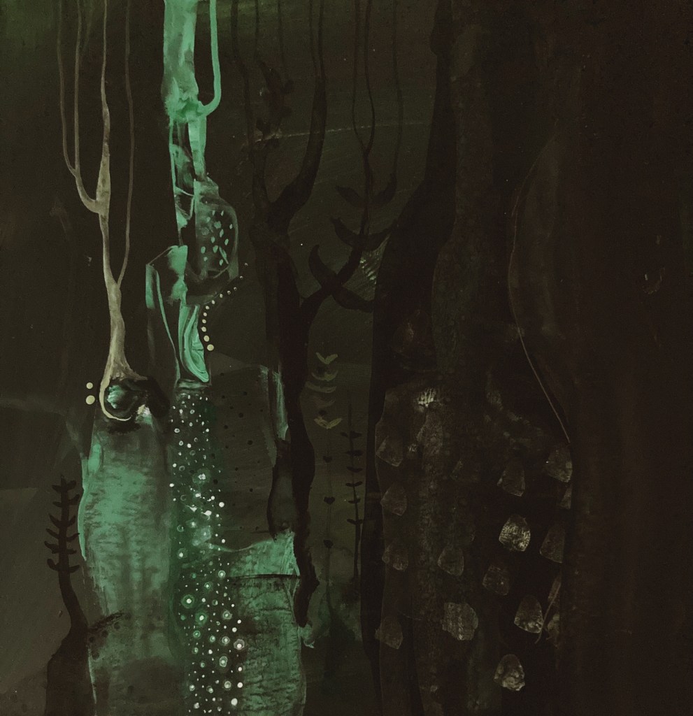
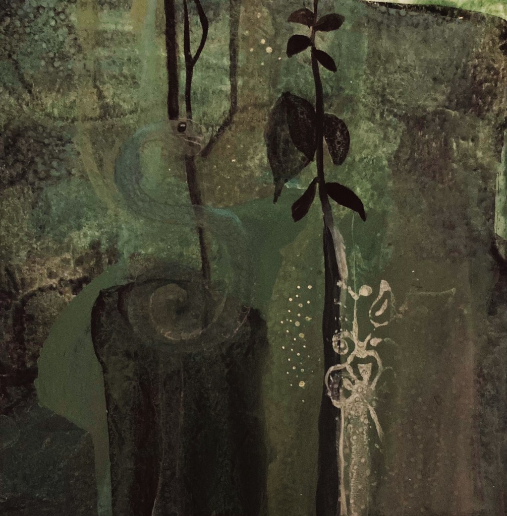
Typically, blue is the dominant colour in my work. It would be turquoise, which I think is the most beautiful colour in the world, if it weren’t for the fact that too much turquoise is like too much sugar, so, I make do with blue.
But I’m sick of it. Instead, the colour that is hitting my internal “ooo I love that” register, is green. Sure, it’s in the same colour family as blue, and makes up half of a good turquoise, but its completely different to blue, and I am really loving it. There is something deep and mysterious, primordial even, about its darker versions, and there is such a wonderful array of its lighter variations, that I feel I could explore it for a while. So, I’m going to.
Here are a few initial experiments:


I totally agree with you! That Teal/Kingfisher/Turquoise feels very dated and for the past year or so (particularly teamed with pink) it has been everywhere. Love your experiments. Bring on the green
LikeLiked by 1 person